[SHOW-OFF] Artwork-Design

PiXeLpUsHeR said:
An all Flash Website I made for an Artist/Musician friend of mine.

1. How about making the graphic on the 'Enter' page clickable?
2. Do you really need the disclaimer/credits on the intro (skip intro) page?
3. On the main page, the white bordered sections seem kinda tacky, can that be tweaked somehow?

Overall, nice and simple site, cool music ! :cool2:
 
I know all I keep doin' is postin' sigs. But that's the only sorta gfx I'm doin' currently. So even though I'd promised myself I won't be postin' any more sigs here ......


@kidrow I like the sigs... really nice...... now you have enough sigs to change them monthly for the next year. :p

thetoxicmind said:
1. How about making the graphic on the 'Enter' page clickable?

2. Do you really need the disclaimer/credits on the intro (skip intro) page?

3. On the main page, the white bordered sections seem kinda tacky, can that be tweaked somehow?

Overall, nice and simple site, cool music ! :cool2:

Thanks for the input... good points ;) The white bordered sections were to simulate the shape of a CD... maybe not so great an idea. The project has been completed and posted already or I would tweak some more :)
 
@joyceanblue, excellent sketch. Post more such stuff. Regarding the 3d stuff, well, I haven't got a clue :S, so I won't say anything.
 
kidrow said:
@joyceanblue, excellent sketch. Post more such stuff. Regarding the 3d stuff, well, I haven't got a clue :S, so I won't say anything.

thanks mate, ill try to find more sketches and scan them. though i spend more time with 3d these days.
 
Here is mine did for Republic day

greetings-r-day-2010-web.jpg

My bro posed for it :p
Some comments on FaceBook page
 
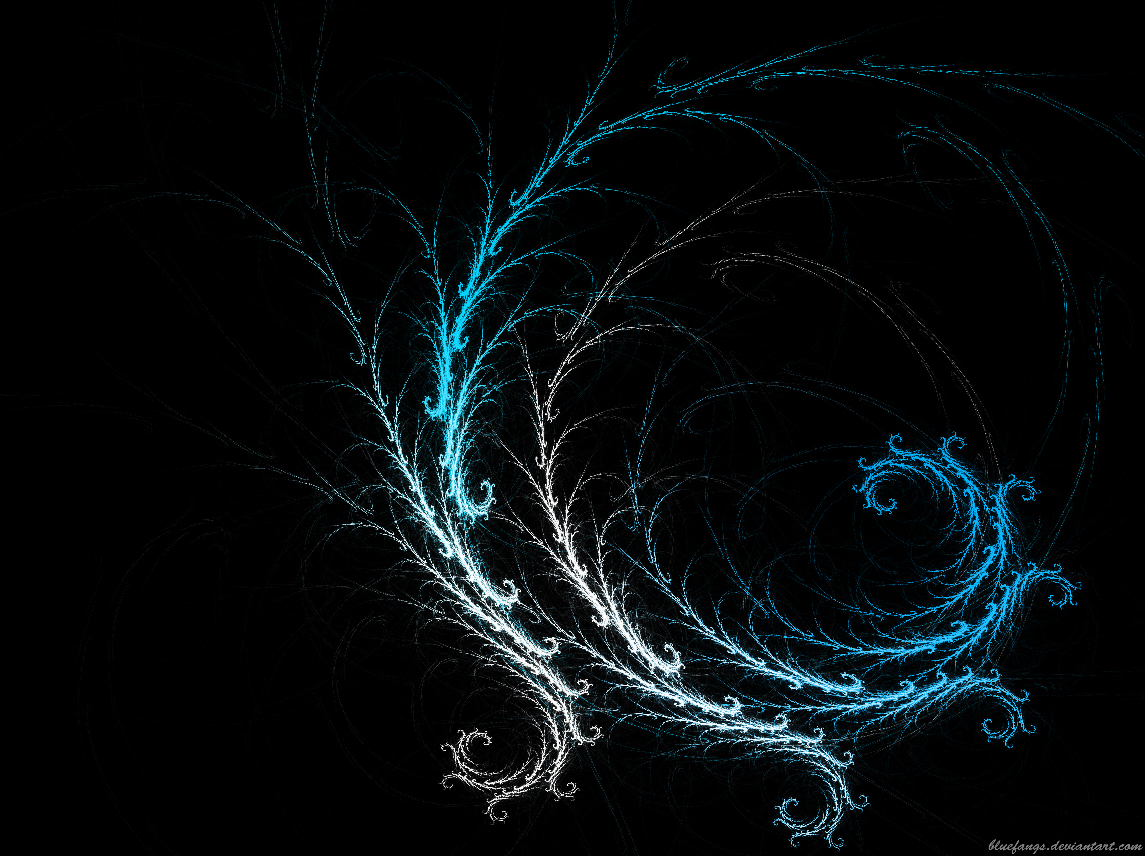
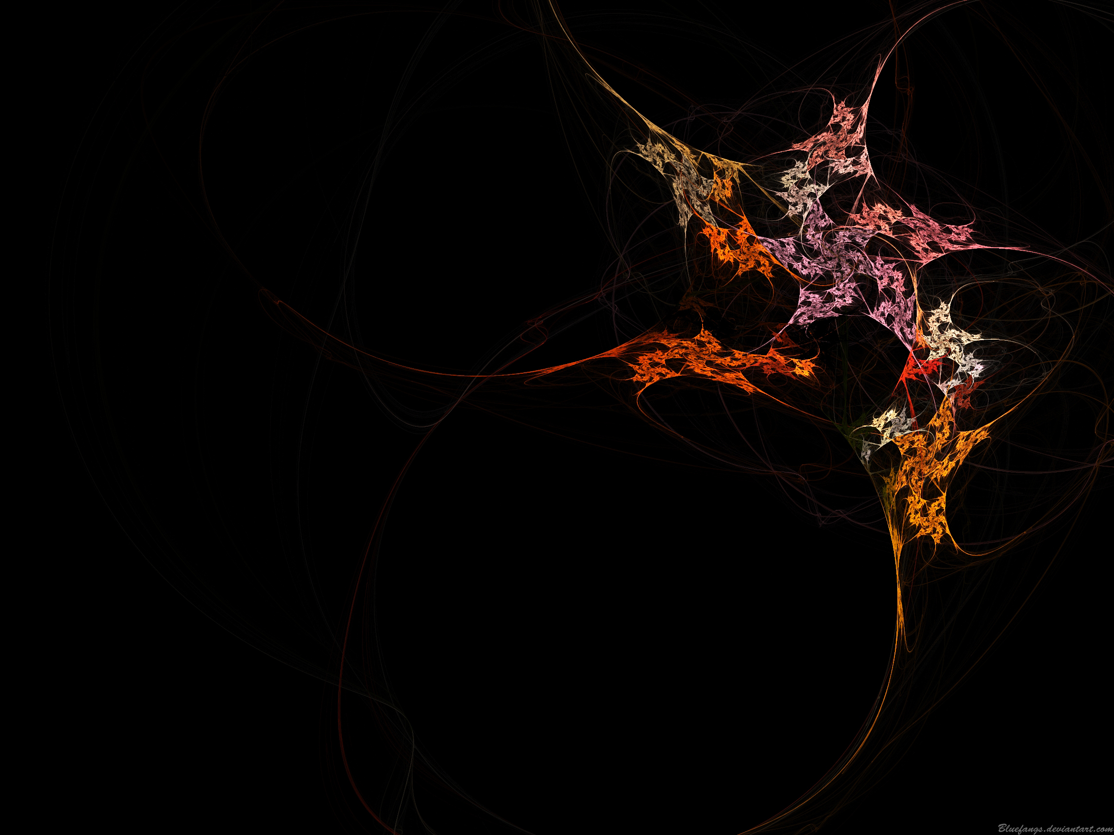
I recently tried my hand at fractal art. These are a few of them (sorry for the Super heavy size cos i've directly hotlinked it with my deviantart profile.)

Frosty_Wall_by_Bluefangs.jpg


Abstract_Wallpaper_by_Bluefangs.jpg


Spiral_Down_by_Bluefangs.jpg


More can be found here
 
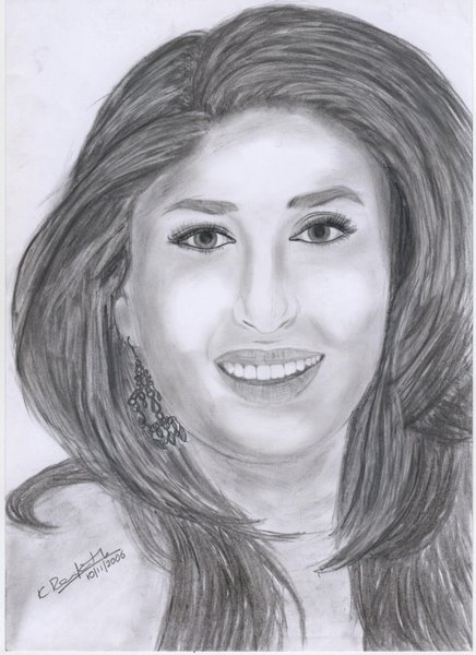
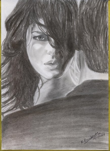
@ravikant - Quite nice - the 2nd sketch. You should sketch more. As for the 1st, though Kareena is recognisable, I don't quite get why her head's shaped that way.

Plus you need to have tremendous patience for sketching of this sort. Also, need to look at the details. For eg., the hair seems to be done in a hurry - as if you just wanted to get it over with. On the 2nd one, there seems to be some direct harsh light hitting her face, esp. on her cheekbones, but there are no highlights in her hair - so it's inconsistent. & why is the hair around the man's jaw light?

@kauzy - Nice. But what is it?
 
kidrow said:
@ravikant - Quite nice - the 2nd sketch. You should sketch more. As for the 1st, though Kareena is recognisable, I don't quite get why her head's shaped that way.

Plus you need to have tremendous patience for sketching of this sort. Also, need to look at the details. For eg., the hair seems to be done in a hurry - as if you just wanted to get it over with. On the 2nd one, there seems to be some direct harsh light hitting her face, esp. on her cheekbones, but there are no highlights in her hair - so it's inconsistent. & why is the hair around the man's jaw light?

Thanks for the comments kidrow. I do agree with what you said. Kareena looked fine then, but looking at this now...almost after 3 years, i laughed at my own sketch :D. And for the 2nd pic, i just wanted to make his chin visible and highlighted it, and i have not concentrated at any details. Will keep these points in mind and try to sketch a better one this time.
 
Back
Top