gangs20003
Disciple
Thanks a lot for the feedback, constructive criticism is always welcome.
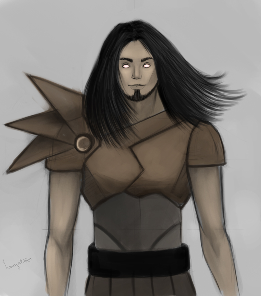
The 1st, 2nd, 4th and 5th weren't really made to have focals, the ones who requested them weren't fans of renders. They wanted more...depth? in their sigs. Like a story.
The 1st, 2nd, 4th and 5th weren't really made to have focals, the ones who requested them weren't fans of renders. They wanted more...depth? in their sigs. Like a story.