Select first option
1 Like
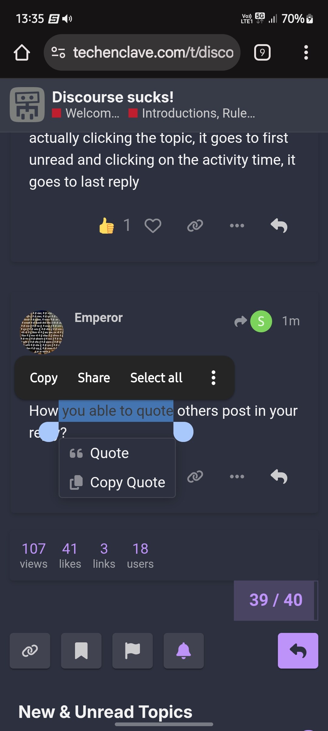
It’s kind of flaky. Sometimes it skips the quote.
Thanks Got it finally
how you got this page setting, I mean those TABs at top of page?
I tested that it works on default theme, doesn’t work on Horizon.
1 Like
I am at a stage wherein I have brainwashed myself into thinking that this is a new site, a new thing I’ve recently discovered. So I take all features as a new thing. Learn something new every day.
Old TE is gone, like many old sites that we outgrew or which disappeared. Basically, this is a new remake of a old classic. Going in with low expectations that it won’t be up to the task. Nostalgia is a helluva drug. Better to indulge in small doses.
Couple of which I changed personally are -
-
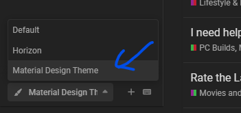
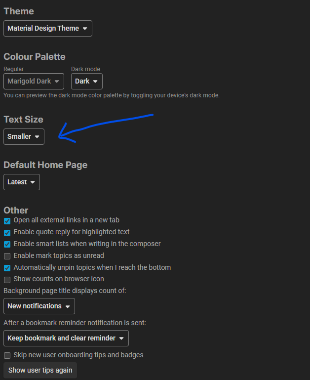
Chose the Material Design theme, love it !!
-
Made the text size smaller.
It works on Material Design Theme as well.
I am trying hard to get adjusted to the new look but failing miserably so I just skip interacting, which will eventually reduce my interest in the forum. I know nothing can be done now so TE bookmark will be deleted from my “Most Visited” option in FF.
2 Likes
yes, because it does not have activity column separately.
Default theme shows for me, i’m in Desktop.
All old timers are figuring out how the new forum works, they are in the same boat as you.
People are joining in, new posts are happening everyday, activity is high.
Why would you let it all go, because of some layout change?
I dont have particular problem with it. Just new ui, it will take time to get used to it. Site feels faster too.
I’m in the same boat. I used to visit the forum multiple times in a day. But now I’m begrudgingly visiting the forum. It’s so tedious and hard to navigate, and it just feels cluttered. The fact that this thread was started 3 hours ago and it already has so many replies goes to show how torn members are about this change. I always saw TE as one of the last bastions of internet forums where activity was still flourishing, but somehow this move seems to be the anti-thesis of user friendly. Why fix something if it ain’t broke?
2 Likes
Change is always inevitable, and it’s a matter of getting used to it. It’s the same when people moved from physical keyboards on phones to touch screens.
I know that the forum in its current state is cluttered and a bit of a sensory overload, but I’m positive it’ll only get better.
Renegade is constantly and tirelessly adding improvements to the forum to make things easier for everyone during the transition phase (especially the old-timers).
Safe to say, TE isn’t disappearing from my bookmarks tab, anytime soon.
1 Like
Thank you, this actually helped make the forum a bit more bearable.
I think the people who’ve been affected the most by this migration are those who primarily browsed TE on desktop, like me. I don’t even have a large monitor (just 24.5”), and yet the experience feels entirely different now, mostly for the worse.
The PWA feels alright in the brief time I’ve used it, which isn’t surprising, since Discourse clearly seems mobile-first. I’m sure I might grow accustomed to it over time, and XenForo will become a distant, fond memory. But for now, these are the issues I’ve faced:
1. Navigation
Infinite scroll just doesn’t serve desktop users well, especially on a forum. It’s easy to jump to the first and last posts, but how do I find my place in the middle of a long thread?
I used to follow ongoing TE threads and could quickly jump to the page where I left off, since I had a landmark. Now I have to scroll blindly and find my place through trial and error. There’s probably a cognitive element to it, too. I can’t quite describe it, but the experience just feels worse. It’s frustrating enough that I’ve stopped engaging with longer threads altogether, unless I’ve been following them from the start.
2. Readability
I’ve tried the Material Design theme and even reduced the font size to “smaller”. Still, the forum feels less readable. Some fonts are too small, others too large. To view the same amount of content I could previously see in XF, I now have to scroll much more. It’s also hard to distinguish between user messages due to a lack of clear separation.
I get that the new spacing and layout aim for a “modern” feel, but for me, it comes at the cost of information density and readability.
3. Categories Page
I really liked the old categories page, and being able to glance through different sections and spot the latest posts in each. That seems to be gone now. The new version just shows the latest posts overall. Also, the subcategory font size is tiny, which strains my eyes. I rarely use the categories page now.
4. History Pollution
Not a major thing, but Discourse clutters up my browser history like crazy. With XF, although not a “feature”, I could use Ctrl + H to jump back to threads I’d recently visited. Now my history is so noisy with every scroll and interaction that it’s unusable for that purpose.
There are more concerns, but I think I’ll stop for now since I honestly don’t feel good complaining like this. I know that Renegade has put in an immense amount of work, and still is, so major props to him. Moreover, I know that I’d feel crushed if all I received was flak. But I really hope that he isn’t taking it personally, since all of us are just voicing our concerns about something we value dearly.
I understand that the move was driven by stagnation in XenForo updates, and I don’t mean to stand in the way of progress, but I’m also not in favour of “progress for the sake of progress”. So far, I haven’t personally seen any major features in Discourse that add value over XF, and I don’t know if we actually needed them to begin with. There are some quality of life changes, but they don’t feel worth it to me.
That said, I know most new users will be fine, many existing users will adapt, and only a small group will significantly cut back or stop using the forum. I don’t believe this is the end of TE, but it has been a frustrating shift, and continues to be so in my personal experience.
9 Likes
My usage also significantly dropped since the move. But I’m getting the hang of Discourse. There’s a quite a bit of a learning curve, but once we’re past that, there are a bunch of nice QoL improvements.
I seriously miss the old categories page though. Right now its just a clump and a mishmash of stuff we can’t easily distinguish. I’m hoping we can improve the UI here and make it more useful and usable.
The old TE felt like home, but that probably is because we were so used to it. We’re talking more than a decade! So its bound to take some time. I’m all for change if it means better way of doing things / better backend.
The only thing I’d ask for right now is the option to use a smaller font- the current font is too big and we need to swipe more to get through paragraphs. I primarily browse TE on desktop but whenever I open it on mobile, its just too big. Other than that, maybe reducing the while space like someone else said.
I used to exclusively use TE on the desktop previously, which also meant I was referring to a lot more content.
Now I just login on mobile, scroll stuff to see if there is an interesting conversation and reply to it.
My activity may have increased but I am also now least bothered to spend more time on more topics, considering content organisation is a mess and that very simple action requires multiple interactions.
1 Like
I agree with @Syzygy and @sama and @codwapeace
This is by and large a downgrade from what we had.
- Quoting works well only on desktop. On Tablets, the quote pop-up is hidden under the tablet UI of copy and paste. I also liked a video of the same,
- Infinite scroll is garbage. Doesn’t work for a forum like ours. Pagination is for a reason. When we read something knowing a page number is easier that trying to remember the post number.
- The discovery that used to happen is now completely gone.
- Smileys are a pain
Can I adapt? I Already have. Do I like it? Not one f*@*₹ING bit!*
2 Likes
This is a huge downgrade from what we had earlier. A straightforward easy to navigate forum. Now it is ruined by confusion. If I quote, or if someone else quotes me, I have to use extra braincells to find out who quoted what. Maybe I am doing it wrong or it’s not super obvious.
3 Likes