Would love if you can help or add codes upon this.
4 posts were merged into an existing topic: Dark Theme / Mode
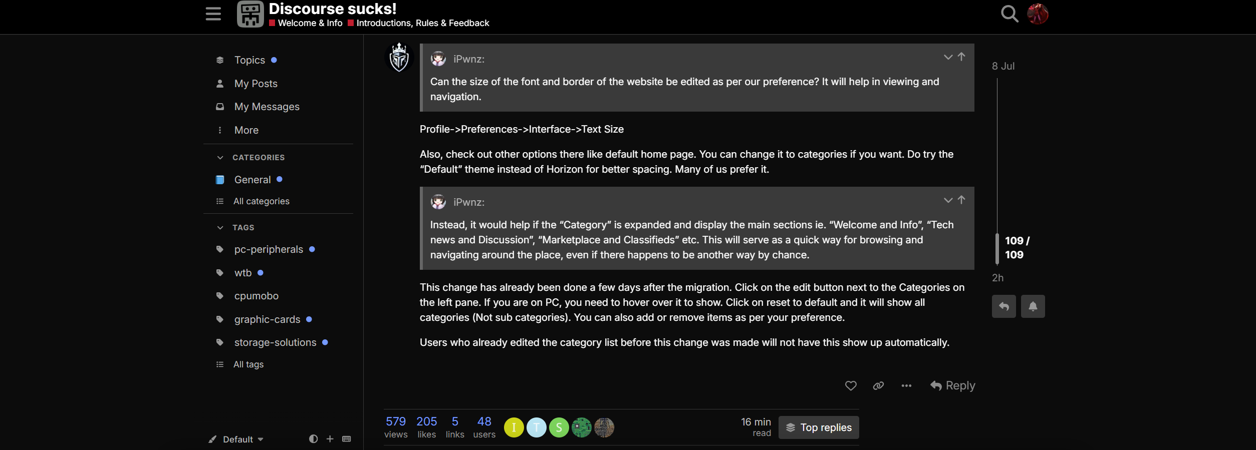
Can the size of the font and border of the website be edited as per our preference? It will help in viewing and navigation.
If I may make a suggestion:
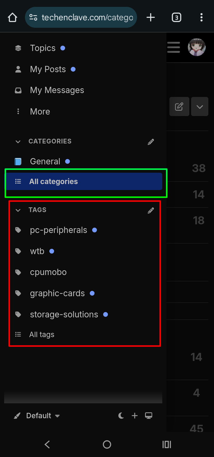
I don’t know how many users find the “tags” useful (I don’t and I’ve never even used it because of its very broad and vast classification, it’s insane) but it would help if they can be pushed further down even if you have to scroll it to get it. I can’t find any option to remove it altogether.
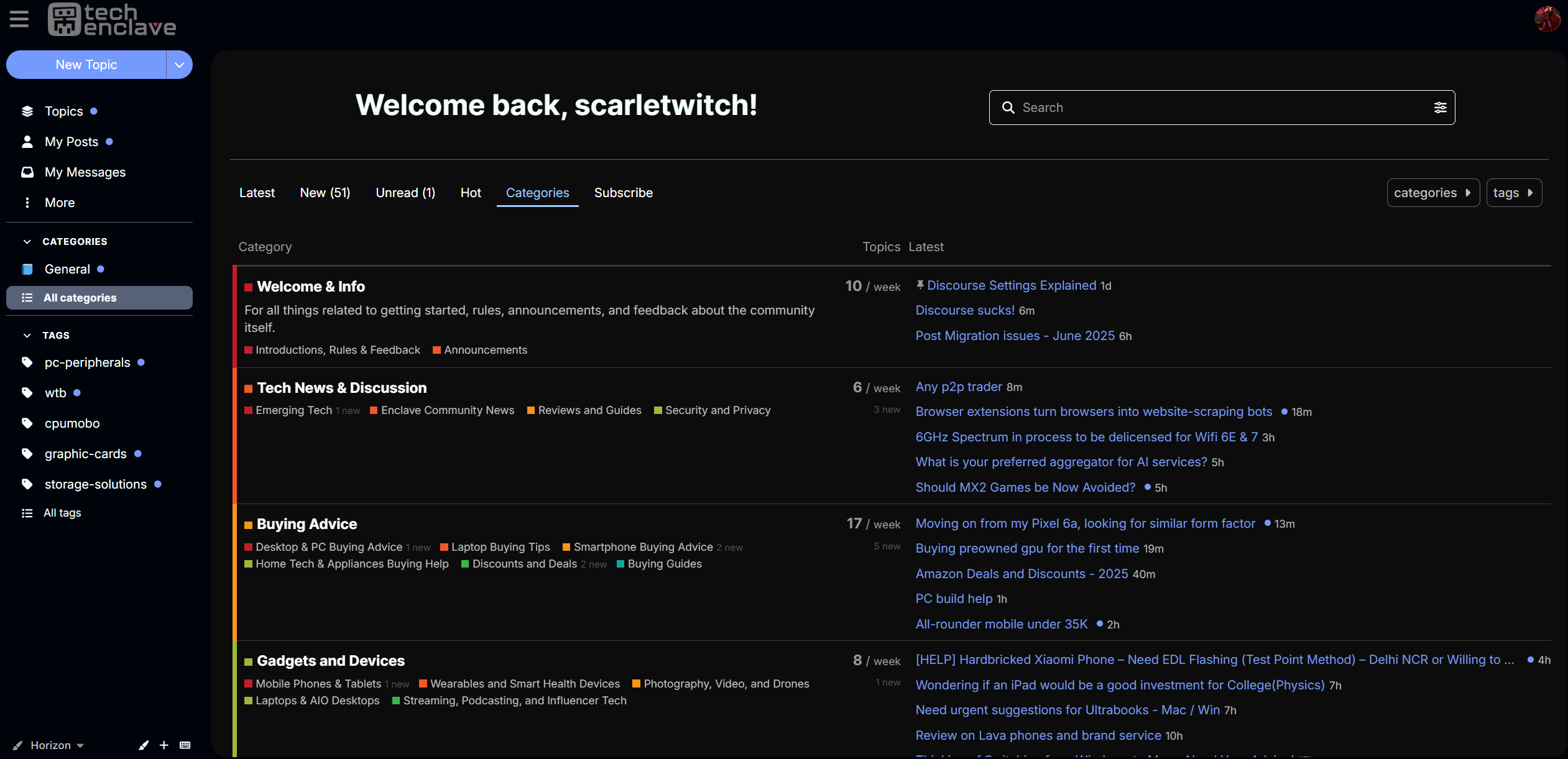
Instead, it would help if the “Category” is expanded and display the main sections ie. “Welcome and Info”, “Tech news and Discussion”, “Marketplace and Classifieds” etc. This will serve as a quick way for browsing and navigating around the place, even if there happens to be another way by chance.
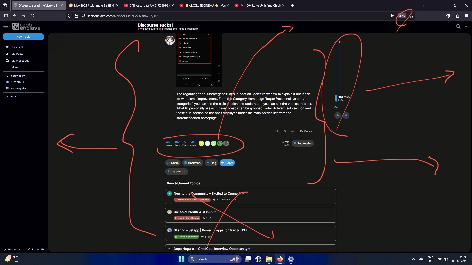
And regarding the “Subcategories” or sub-section I don’t know how to explain it but it can do with some improvement. From the Category Homepage “https: //techenclave com/categories” you can see the main section and underneath you can see the various threads. What I’d personally like is if these individual threads can be grouped under different sub-section and those sub-section be the ones displayed under the main section list from the aforementioned homepage. Eg. If Marketplace and Classifieds is the Main category/section then sub-category can be Rules, End User Listing, Retailers section etc. Let the individual threads be listed under those sub-categories. This way the user interface of the overall layout will look like that of the old one and be more user friendly, at least in my opinion anyway.
Do this everywhere and everyone will love it. Stretch everything so we don’t have to scroll much. mic drop
You’re welcome. Expecting the best designer in the forum badge for my contribution.
3 Likes
I totally understand the frustration but there would be a time we need to move because of the limited choice we had. nothing remains as it should be. i think we just need to adapt the new forum and suggest the improvements. it was decided for a better future of TE. while i personally like flarum, i am surprised how admin managed to import everything and given all the features we had including marketplace. it takes a lot of time, a lot of.
i wish we had choices, few more.
All of those who keep saying we should move , we should move .. Yes we should move .. But only to a better coding language , modern architecture.. all the while retaining the styling(forum) , usability or something which can enhance already a better system
1 Like
My company moved whole research team from spreadsheets to home grown overdrive and pored in huge money to make it better after 4 years of constant struggle and displeasure from the community they closed overdrive and moved back to spreadsheets. Moral of the story, They tried to fix something which was not broken and ended up spoiling it further (lost money and faced team displeasure)
10 Likes
I don’t think that going back to Xenforo (or similar traditional forum software) will ever be considered, since Renegade’s sentiments have been pretty clear from the start. I genuinely wish we could, but I know it won’t happen.
All we can probably do now is share suggestions about how to improve the current implementation and get used to it over time. Pushing back against the change seems like a futile effort.
Profile->Preferences->Interface->Text Size
Also, check out other options there like default home page. You can change it to categories if you want. Do try the “Default” theme instead of Horizon for better spacing. Many of us prefer it.
This change has already been done a few days after the migration. Click on the edit button next to the Categories on the left pane. If you are on PC, you need to hover over it to show. Click on reset to default and it will show all categories (Not sub categories). You can also add or remove items as per your preference.
Users who already edited the category list before this change was made will not have this show up automatically.
1 Like
I know moving back is not an option here but if we consider above example then what made people stay with my company (Money/Job security) that is not the case here and users will simply leave after trying for sometime. Old users have already shown there displeasure and the time will come when the engagement will reduce.
Personally speaking I haven’t tried to even look at the setting. I don’t come here to first fix the forum then engage in conversation (Its not worth the time).
2 Likes
Please share how you did that. I need that amoled black, is that using an extension?
It looks like the WCAG Dark colour palette (Preferences → Interface). Only the header banner looks like it’s amoled black. The main body of the page doesn’t look like that, and is probably just very dark grey.
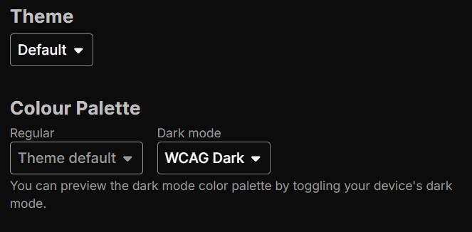
If you just need the black, then no extensions are needed. Just choose this combo of WCAG Dark.
If you need the width, then yes, we have to use extensions like Stylebot and adjust accordingly.
1 Like
I don’t think the forum will die due to the changes, and even if it does (a minuscule chance), this was sadly acknowledged as an accepted outcome when the migration was being planned. But like I said, there’s only a very small chance of that happening.
New users continue joining and will be fine with it. Some old users have used discourse elsewhere and are okay. Some old users are dissatisfied but are trying to accept change gradually. And there will be a small percentage of old users who will reduce their activity or drop off completely in some time. But that’s unlikely to make a large dent in the forum and it’ll keep on going. At least that’s the outcome I see happening realistically, even though I dislike the migration.
I hope that the forum goes on and thrives for years to come. And hopefully, all of us are still there when that’s the case. ![]()
Played around a bit more. It looks even better with Horizon theme and full width. Obviously, a lot many things can be made even more crisp and aligned.
There’s nothing to fix, in my opinion.
I haven’t changed any settings, just switched to the default Discourse theme, which I think is the best one.
It seems to me that Discourse, as a forum platform, might be a bit too advanced for some people. The issue is that many didn’t take the time to try it out during the demo phase.
Now, being introduced to all this new information about the forum at once and also learning it, is overwhelming. The new layout and how everything works is a big shift.
For many, the old setup was working just fine because “if it ain’t broke, don’t fix it,” comes to mind.
But now that I have seen it in action, I believe the admin was right the switch was necessary to stay relevant moving forward.
At the same time, he didn’t want the platform to fall behind. He has a broader perspective, thinking not just about the present but also about the forum’s future. While we, as users, tend to focus mainly on our own posts, conversations, and personal comfort, he has to consider the bigger picture and making things comfortable on his end too. New tools and processes are generally efficient.
I am sure a lot of thought went into the decision and also the choice of the forum, and the benefits must have far outweighed the drawbacks.
1 Like
This made things a bit easy
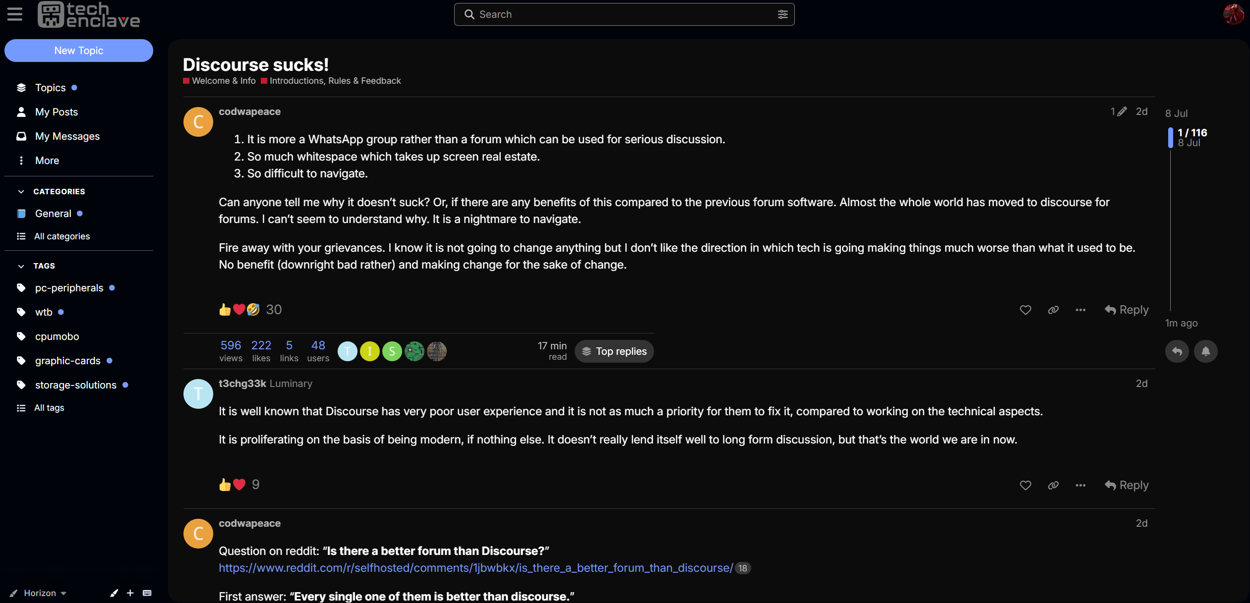
Mentioned it once already but can’t figure out why quoting is a chore on Discourse.
Be default, you have nothing quoted within the reply.
You have to select text, which is irritating to do on a mobile screen and interface.
Nesting of quoting is not retained, so you cannot retain context.
If I click the quoted post, sometimes it scrolls me 100s of posts up but the return option is unavailable.
Again, this is purely a chat setup, rather than a discussion one.
3 Likes
You can just click on the last post number in the right side scroll bar to jump to the end of the thread. You can also remember the post number in the side scroll bar before clicking the quoted post & then replace the post number at the end of url in address bar of browser with that number & hit enter.