^am already broke and living with just bread and peanut butter for meals

yeah we are aware of the "quotes" issue.
yeah we are aware of the "quotes" issue.
Which colors need to be changed. Which ones do not match the palette.The colours also need to be changed. Lot of mismatch in palette

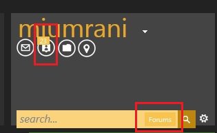
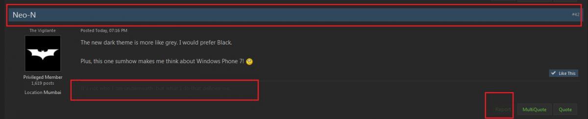
For instance, the 'Report' button on a post is not easily visible.
^am already broke and living with just bread and peanut butter for meals
yeah we are aware of the "quotes" issue.
Which colors need to be changed. Which ones do not match the palette.

While viewing photos in one of the thread in showoff section there was one problem,after clicking on one image it didn't pop up as usual,the image was at the bottom of the page and it was way down so mods also consider this issue.
A few things to note
- Its not possible to please everyone so some of you might feel left out
- Some of those colors can be looked at while others are universal so can't be touched. Most of them look fine to me.
- Some of the features (like attachment, quotes, lists) on dark theme aren't working properly because a couple of CSS files are not loading.
I see some of style sheets are not loading. Have you tried linking other stylesheets in main stylesheet?
Maybe they are not getting initialized.
The walls are thick but the soil is not as brown.IMO simplicty and soberness will be lost
If it were that simple.
@import url('style1.css');