# Renegade
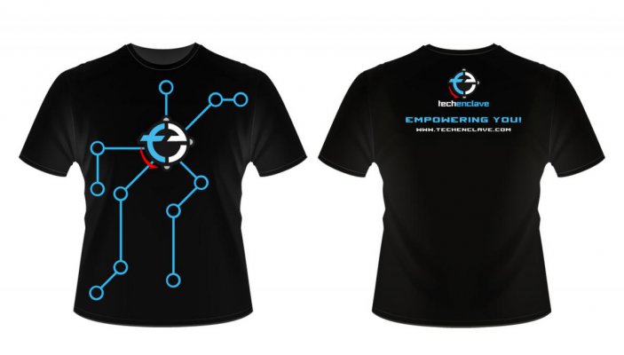
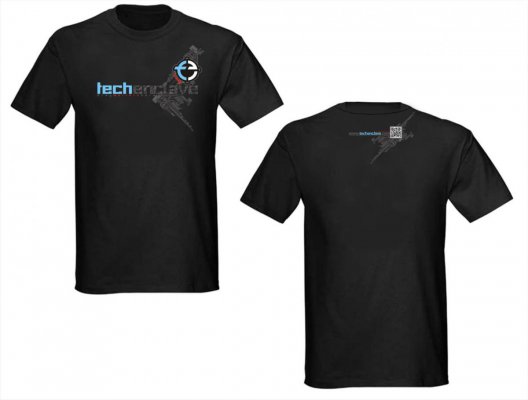
The 2nd design in front ie having TE logo on the left of tshirt and another round one with 3colors. It resembles the flag of France. Can you avoid it.
@ others
I do agree that the tag "Always a Geek" sounds flimsy. Better go with TE slogan. Also the slogan if stitched looks cool rather than imprints. I do agree it costs more.
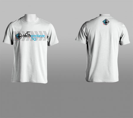
The French flag design is already avoided.
By stitched you mean embroidered? It will be very costly I think.
#Renegade
In office. can't see a single pic. Damn proxy
Yeah it is hosted on imageshack. Can't see myself.
I am looking to get some designs worked out from outside TE in the next few days. So request you all to suggest improvements in the designs that I post from now on.
TED 201
[attachment=12226:12813646-original.jpg]