Samsung Focus
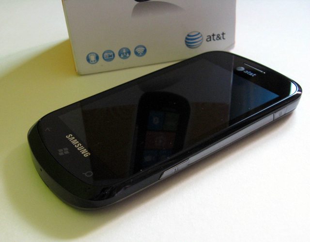
The courier guy delivers a package that you were waiting for days! The little kid in you jumps with joy and you tear down the multiple layers of packing like it’s your birthday (except it’s not and you bought it with Credit Card – ahh! reality sucks ). You open the box and the first thing you see is the phone with its front all black shining with reflection of surroundings. You say to yourself – That’s Gorgeous! Money well spent! But when you pick it up, you notice two things – $hit its all plastic! And it’s surprisingly light for its size! Then you remove the back cover to insert battery and at that moment you feel confused whether you bought Rs.2000 phone. You try to estimate the cost of back cover, curse Samsung for its frugality and switch on the device. And you’re greeted with a 4†Super AMOLED screen – the vibrancy of which quashes all the concerns you had about its build quality. “In any case the screen is the most important thing†– you console yourself; still gazing at the marvelous screen.
Design
The Focus is an all plastic device having 4†Super-AMOLED display with resolution of 480x800. It’s very slim measuring at 9.9mm. It’s pretty close to the optimum thickness – balance between aesthetics and usability – a personal opinion. As much as I hate the all plastic build, I like the design. It looks great and is extremely light which helps when you’re holding the device for longer periods. The battery cover is extremely thin and looks cheap and is a fingerprint magnet (3 strikes). But other than that I have no issues with overall build quality.


The left side has volume button which has a nice click to it. Same with the power button and camera button on the right side. Camera button is two-stage. But the second half is not as pronounced as the first one, could have been better.
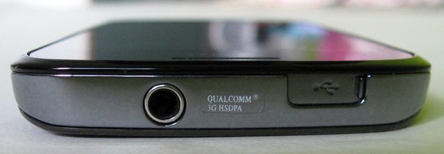
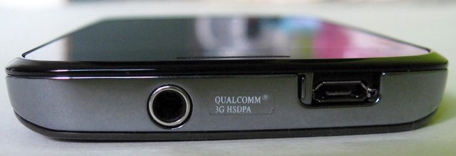
The top has 3.5mm audio jack and micro-USB port having a slider which covers it’s from dust – nice!
The back cover has a tapered design and holds the 5Mp snapper with single LED flash and speaker grill on the top.
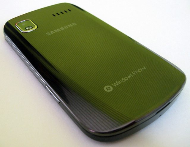
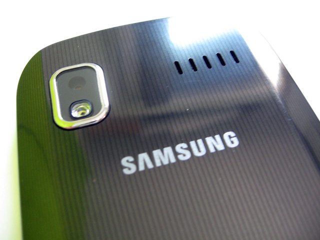
The top edge and 3/4th of both sides are silver which enhances the appearance.
Overall it’s a pretty good looking phone with average build quality.
Windows Phone 7
This is a gorgeous looking OS (personal opinion). And the SAMOLED + Metro UI combo is kickass. The two things that you notice immediately are –
- It’s damn SMOOTH and fast!
- Microsoft’s attention to detail in terms of UX
The most controversial part of the UI is the home screen – which replaces the usual home-screen-with-icons-and-widgets paradigm with (live) tiles. This seems like a seminal approach at first although in theory it’s still a normal home screen with rectangular widgets. But from what I have read on the internet, people either love the tiles or hate it – almost black and white opinions. When I showed my Focus to colleagues, they were awed at first and after about 30 seconds of scrolling left-right / up-down, their first question was – ok, where is the home screen? Microsoft tried following Apple’s footsteps – designing a UI which is SIMPLE and eye-candy but that seems to have gone wrong at some places.
For me, the most surprising aspect of the UX was their attention to detail. The animations for even the most trivial user interactions just make you go wow! Even iOS seems bland in comparison. I can give you many examples but you cannot appreciate it until you actually use it. It’s like Windows Phone 7 division of Microsoft is run by an artist instead of your typical Ivy league MBA grad.
Mango Beta 2 (7712) –
Most of you must have read WP7 reviews by now so I won’t repeat every little detail. I will just mention the things that I liked the most and some enhancements in Mango version (beta 2, 7712)
Boot Time –
I don’t know if it’s due to the less number of installed apps, but my Focus boots in less than 20 secs which is pretty cool!
Home Screen –
On the home screen, when you swipe to the right pane, you get list of apps. In pre-Mango version, there was no option to jump to a particular letter or search for an app. You would have to scroll through the list every time. Now you can jump to a letter directly or search for an app to narrow it down. This makes it easier than before but still I would have preferred some sort of folder structure to categorize the list. Because once you have installed a good number of apps, always scrolling through the lists become annoying. And the list is in ascending alphabetical order. You cannot even customize the order.
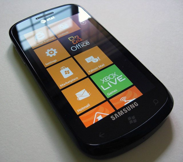
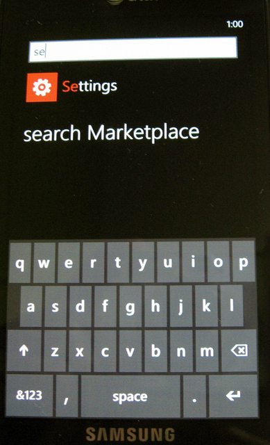
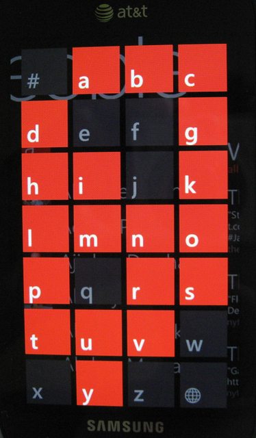
Say you have 10 apps that you use every day. So you can either scroll through the app list every time (even search/ jump to a letter takes multiple clicks) OR pin every important thing on your home screen. Now if you pin everything on home screen, then again you will have to scroll down to get to the last app. To summarize, there will be a lot of scrolling involved of you are an app junkie. Note that I am not saying scrolling will be irritating because it’s not smooth or anything. But once the UI novelty fades, you would want efficiency in your day to day work. And scrolling or multiple clicks is definitely not the easiest approach.
Multitasking –
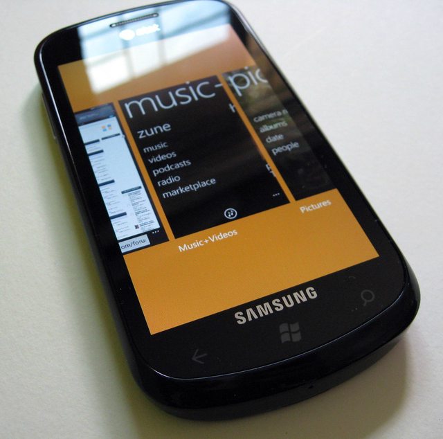
Mango introduces multi-tasking. Now when you are inside an app, and you press the center Home button (Windows icon) the app goes into background. If you press back button while you are in an app, it kills the app. But long press the back button (about 2 secs) and you get app-switching view showing all the apps running currently at a glance and you can select the one you want with a tap. It only shows the last 6 apps and there is no way of closing all the apps at once or closing them individually (tapping the small cross in corner to close the app). So you have to press back button in every app to close it. It’s not as flexible as I expected.
Moreover, developers will have to incorporate code in their app to make it work in the background. So many of the current apps will go into paused state and again refresh when you go back. For example IM+ the all in one messenger app will again check for connection, refresh your online contacts list when you switch to it. Say you’re in the middle of a conversation on GTalk and want to check news. So you press Home button and open IE, check the news, long ress the back button and come back to IM+. Now you want to continue the conversation where you left off. But IM+ starts from the beginning. It again connects to the server, gets your online contacts list etc…you get the idea!
So it’s not enough that Mango brings multi-tasking. Developers should upgrade their current apps to take that advantage. I am sure it’s not a herculean task for developers but just don’t expect every app to magically start working in the background after Mango update. Actually this is why developers are provided with OS beta updates. So let’s hope that all the current apps will be updated when Mango is officially released.
Social Integration –
Mango excels in many ways when it comes to social integration. Once you setup your Facebook, Gmail, Twitter and LinkedIn accounts, you get
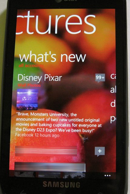
- All the updates from Facebook, Twitter, LinkedIn, Windows Live into the “People Hubâ€. The People Hub has 3 panes. First has the list of your contacts, second has list of recent contacts and third has social updates. You can decide which contacts should appear in your Contacts pane, which updates (only contacts / all) in your updates pane. Also assigning the contacts with their social network accounts is extremely easy. If the contact name is same as their social profile name, it will assign it automatically. Else it will provide suggestions of you can assign manually with a few clicks. Once this is setup, you can see the contact’s social updates by swiping right in his/her contact page. Swiping one more time gives his/her pictures. Swype again and you will see the recent history – calls / texts / IMs.
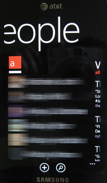
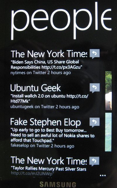
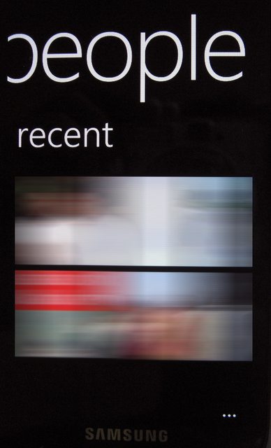
- In Messaging app, your conversations are shown as threads. Swiping right takes you to the online friends on Facebook / Windows Live. You can set your status as Available/Busy/Away/Appear Offline/ Offline. To get your Facebook friends to show up you have to do this first.
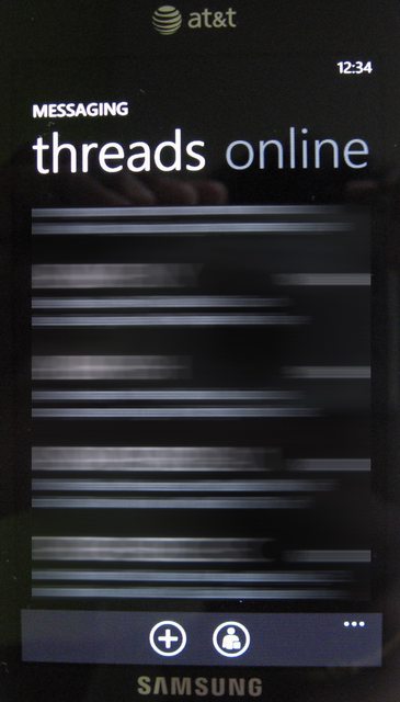
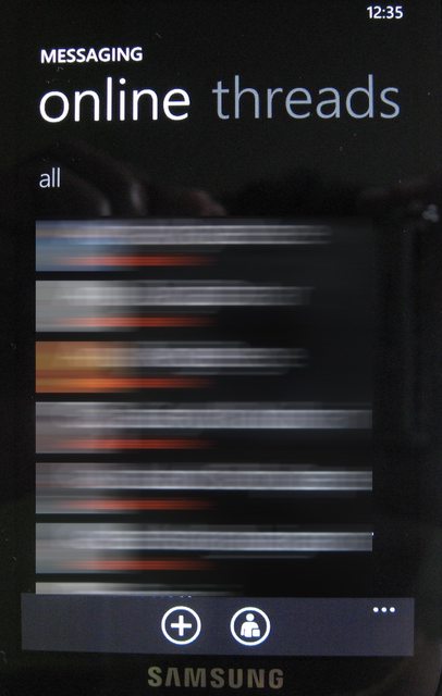
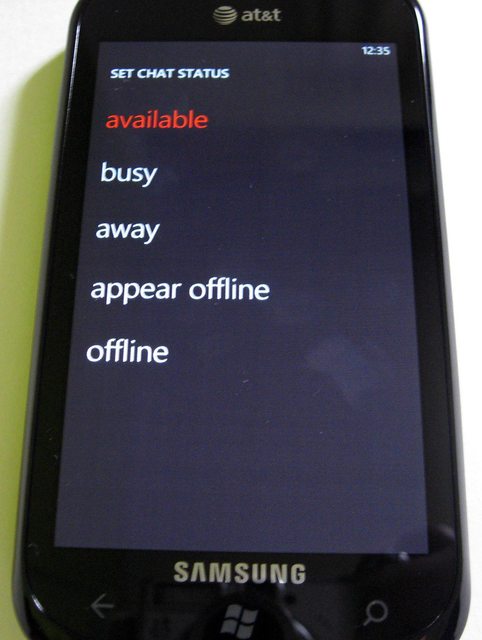
But once you do this, it’s a great experience. You don’t have to open any app to start chatting. It’s integrated in your Messaging app. The only thing missing in this is – Gtalk and Skype. Skype should come in near future since Microsoft now owns it. So we can expect the same kind of tight integration with Skype. But I am skeptical about GTalk integration.
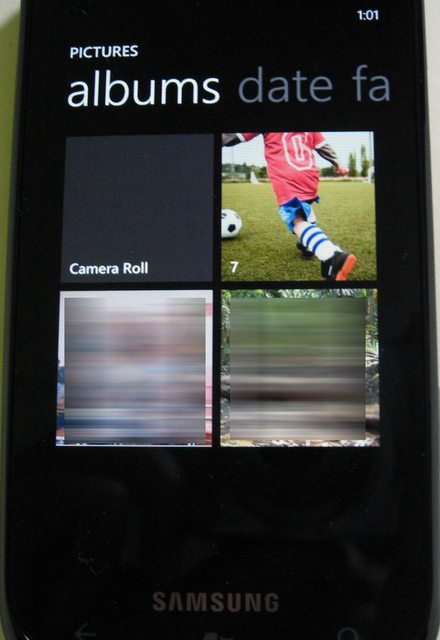
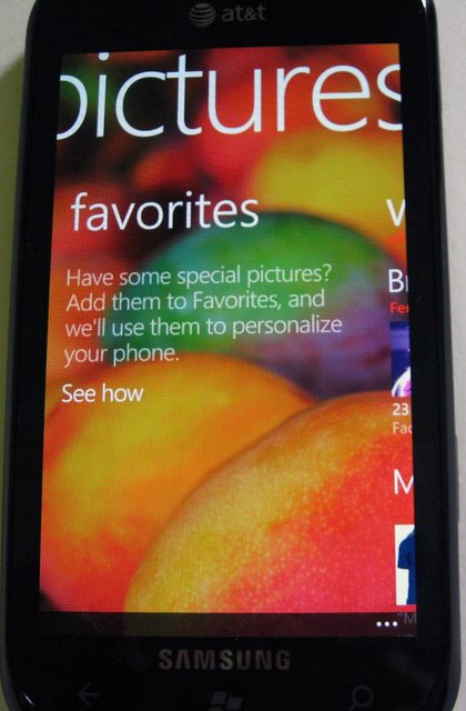
In Photos Hub, first pane shows all the photos on your device + your photos from social networks. The second pane shows your favorite photos. The 3rd pane shows photos from your friend’s social networks.
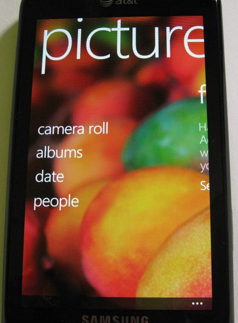
As much I like this, I wonder how data-heavy is it? I have used it mostly at home till now on WiFi. But users who will have 3G with very limited data plans should research this further.
By the way, those of you wondering why you don’t see each and every update on Facebook in your People Hub, check this link for clarification.
Still, one thing missing in People Hub is - invites on Facebook / LinkedIn. You cannot see new friend requests in People Hub. For that you have to log into either Facebook app or Facebook Mobile.
Email –
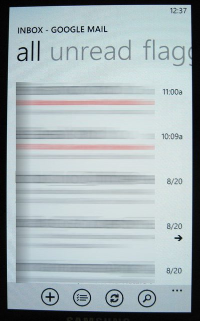
This has to be the one of the best if not the best email experience across all OS platforms. Setting accounts is a breeze and the UI is really well thought out. There are 4 panes – All, Unread, Flagged and Urgent. This makes glancing through the mails much easier – with just a swipe! Typing mails is easy thanks to the great onscreen keyboard.
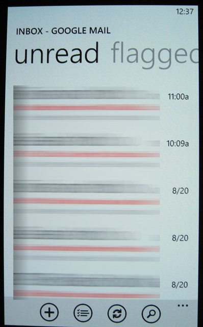
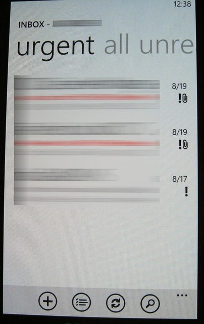
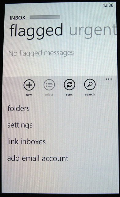
One thing I didn’t seem to find is – there is no option to download just the headers. Again this comes in handy if you are on a strict data plan and don’t need to download every mail. But overall I don’t have anything major to complain about.
The email app is one of the major reasons why I will keep WP7 as my primary phone.
Edit: It automatically downloads only a part of mail if the mail content is too large (I am not sure the exact cut-off but even mails greater than 100KB are downloaded partially). In such cases, there is a link which states "Download Message". When you click on it, the rest of the mail content is downloaded - nice!
IE9
IE9 is very good in terms of page rendering and smoothness during scrolling. But I have few complaints. They have changed the UI in Mango Beta. Previously ‘Favorites’ and ‘New Tab’ icons were at the bottom of screen, readily accessible with single tap. But now you have to open the options and select it. This is irritating if you have used previous version. They messed up a good UI when they ‘upgraded’ the version
You can open a maximum of 6 tabs (Note: this is Beta version). And you can either switch between tabs by going to the Tabs option or by opening the app switcher.
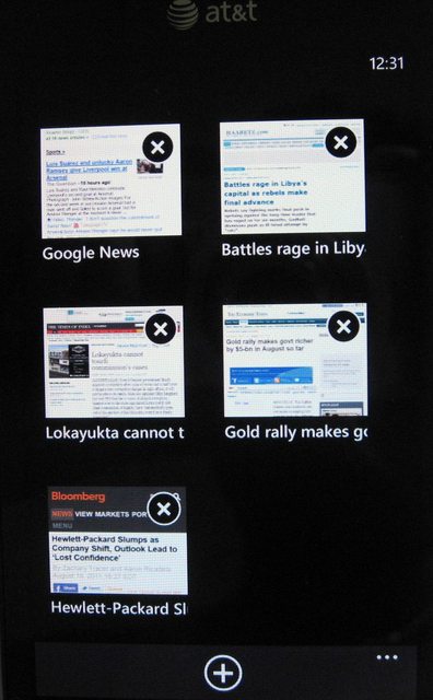
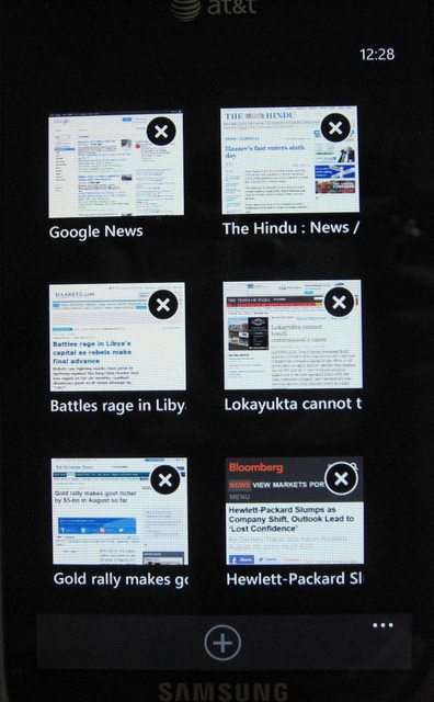
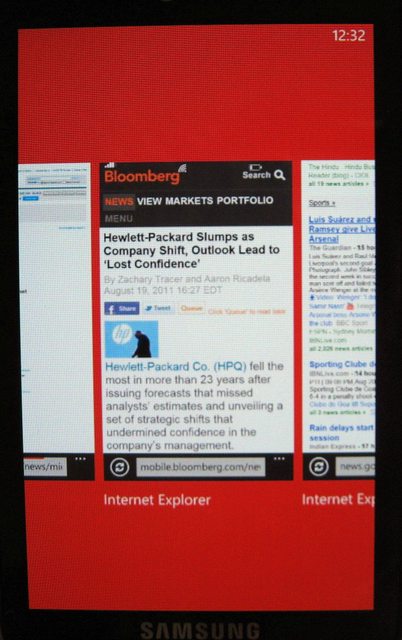
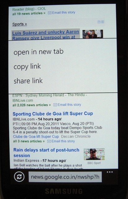
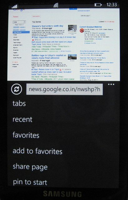
There is NO text reflow in IE9. It will not matter for 80-90% of time because on double tap it gives you perfectly readable text. But for the remaining 10-20% of time, you will have to scroll left-right to read the lines. This is where you miss the choice of having multiple browser options like other OS platforms. Even Symbian has Opera which supports text reflow.
MS Office
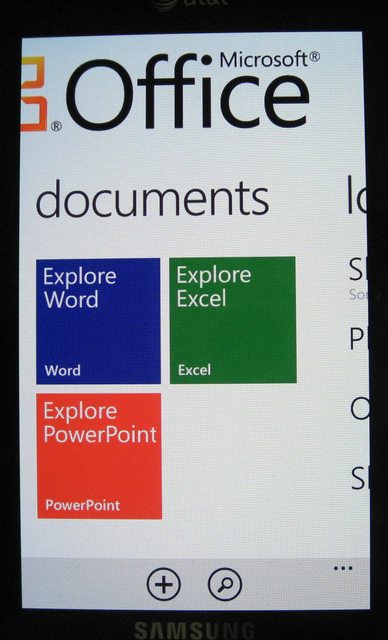
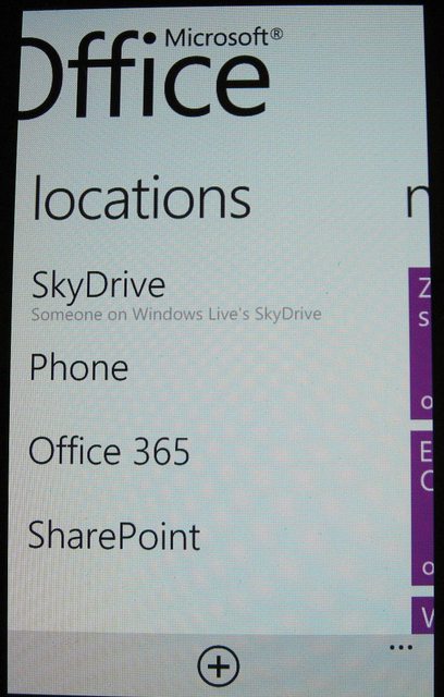
Office support is very good – as expected. You can edit Word/Excel/Power Point documents. I have not yet used it much but at the same time have not faced any issues so far. Your One Notes and documents are synced with SkyDrive account.
One major disappointment is lack of Office Communicator! I mean it’s MS product right? I have read that they are not gonna include OC but directly jump to Lync – hope they do it fast. But even in that case, I am not sure if Lync will support older OC versions. If not, most of the organizations still use old OC and Lync support is of no use to them.
Music + Videos Hub
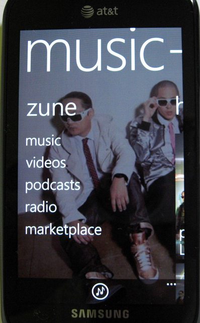
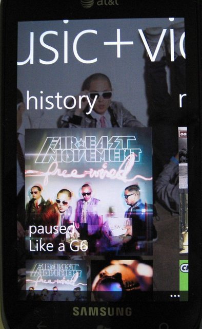
This is one gorgeous looking app! The background changes to a panoramic view of the artist you’re playing currently. It looks awesome! But at the same time, there is no option to set your custom panoramic wallpaper for any artist. So even if you don’t like the wallpaper provided by Zune, you are stuck with it. Or, say you are playing a local song and Zune does not recognize the artist name, then it will show the last artist’s image – it won’t change to a default black background. So even though the idea is fantastic, the execution is somewhat inconsistent.
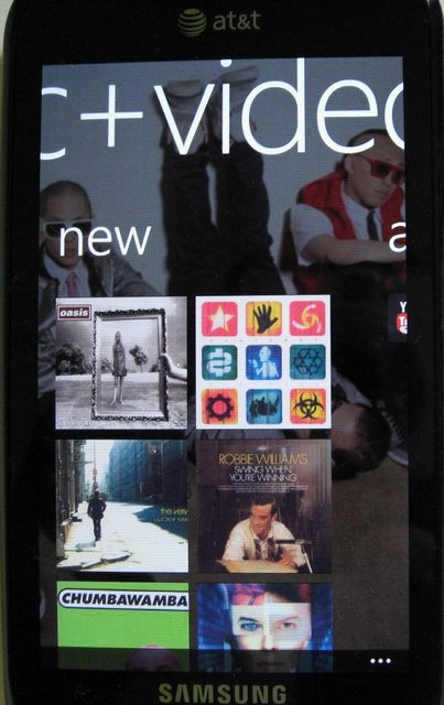
The videos look amazing on the 4†SAMOLED – no doubt. But the codec support is just average. No support for XViD / mkv’s (Matroska) etc. So you have to convert it to WP7 compatible format. When you drag any video to your phone in Zune software, it automatically converts the video if required.
I expect a media player along the lines of VLC (or CorePlayer for Symbian) to be launched soon or else WP7 cannot survive in the multimedia category.
Market Place & XBox Live
Market Place has some good apps but variety is nowhere near iOS / android. But things are improving and once new handsets with Mango launch and Nokia’s mass market handsets launch next year, the Apps & games scene will improve drastically.
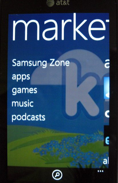
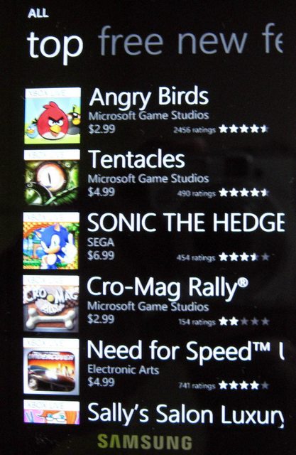
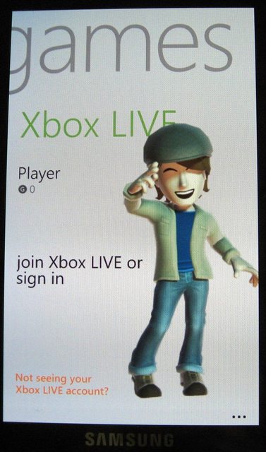
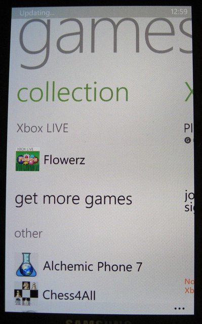
I don't play games that much so no idea about how good/bad XBox Live is. But here are couple of screens
Camera
Camera performance is very good. I have no complaints so far. Picture Quality is good for a 5Mp snapper. 720p Video recording is good, not as good as my C7-00 though. I will try to post a sample in next few days.
Here are couple of macros


Calling / Network –
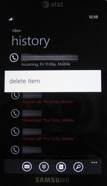
Call quality is good and have not faced any issues so far. Signal reception also seems to be good. But one small thing I noticed is that you cannot save a number through Call History. So if I receive a call from unknown number, I cannot just long press the number and select ‘Save Number’ or something like that Edit: Saving unknown number is possible. Click on the number as you normally do instead of long press, and you are directed to a new page. Here, at the bottom of screen there is 'Save' icon. [Thanks Sei for the info!]
One laughable lack of feature is – you cannot set different volume level for Ringtone, Alarm and Music Player. The volume control is common for all. So if you set 15/30 volume, this value applies to EVERYTHING
In Mango, you can set your custom Ringtone. But there are quite a few restrictions on it.
Bing Vision
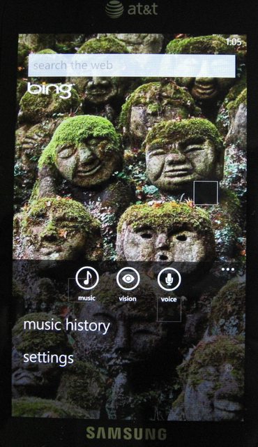
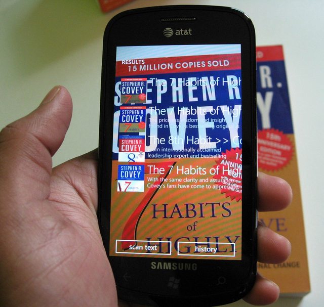
This is a cool feature. Open Search, click on Vision and put any Book / CD / DVD / Barcode in front of it. You don’t have to do anything else. The camera automatically focuses on the image and recognizes the cover. It then provides the info/reviews/purchase links of that item.
Battery Life –
Battery life is average. I am not sure if the battery life that I am experiencing has anything to do with Mango Beta 2 so take it with pinch of salt.
I get 1 day of battery life with –
- few calls, texts,
- about 1hr of WiFi,
- constantly connected over EDGE/3G,
- 1-2hrs of music
To my surprise, there is no option to toggle 3G on/off. This is a standard WP7 feature. My Optimus 7 has it. But the $hit known as AT&T have removed it from Focus.
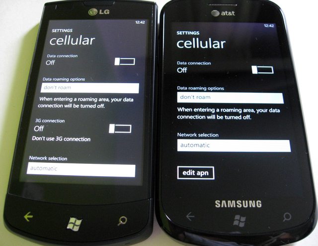
There is a registry entry hack to get the option into settings menu. But that does not work in Mango Beta (at least I have not been able to do that).
I am using Idea Rs.98 monthly GPRS plan and don’t use 3G. The signal at my house is above average but not strong enough so it drains battery like crazy because it is in 3G mode. While in office, it stays on 2G and battery lasts longer. So on weekends when I am at home, my battery drains completely in less than 12hrs
As I said, activating the 3G toggle option is possible since it’s just a registry hack. So it will be available soon. But for now I am stuck with no alternative – which sucks. Even my Nokia 6630 had this option in 2006. So much for a modern smartphone
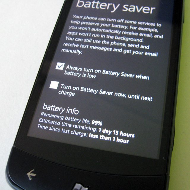
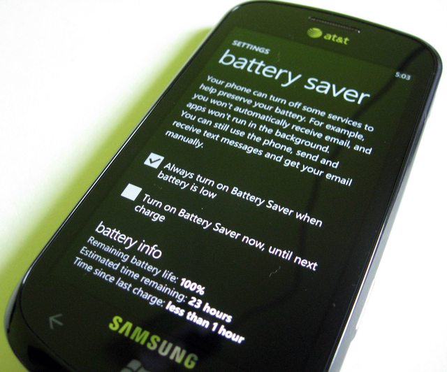
A very surprising fact! Even though Focus and Optimus have same 1500mAh battery, O7 charges faster and lasts almost 50% longer than Focus in day to day use. Don't believe me? Check this - even WP7 agrees with me :rofl:
Summary
Even after so many shortcomings, I have high hopes on Apollo – the next major Windows Phone release. Why? Because the features that they have implemented work beautifully and are pleasure to use. So if they add remaining features in similar way, we have a very strong future contender. But in mobile industry, couple of months equals a year. So, be six months late to the party and expect to get wiped out by the competition
I think MS needs to address following issues immediately –
- USB Mass Storage – really MS?? We have to ask this?
- Bluetooth File Transfer
- GTalk and Skype integration
- Separate volume control for Ringtone, Alarm, Music Player – do we really have to ask this!
- Text reflow in IE9
Edit:
- Proper File System access through the phone like Symbian
And I also expect features like USB OTG to be included in Apollo
Anyways, this is it. Sorry for such a long review :ashamed:


The courier guy delivers a package that you were waiting for days! The little kid in you jumps with joy and you tear down the multiple layers of packing like it’s your birthday (except it’s not and you bought it with Credit Card – ahh! reality sucks
 ). You open the box and the first thing you see is the phone with its front all black shining with reflection of surroundings. You say to yourself – That’s Gorgeous! Money well spent! But when you pick it up, you notice two things – $hit its all plastic! And it’s surprisingly light for its size! Then you remove the back cover to insert battery and at that moment you feel confused whether you bought Rs.2000 phone. You try to estimate the cost of back cover, curse Samsung for its frugality and switch on the device. And you’re greeted with a 4†Super AMOLED screen – the vibrancy of which quashes all the concerns you had about its build quality. “In any case the screen is the most important thing†– you console yourself; still gazing at the marvelous screen.
Design
The Focus is an all plastic device having 4†Super-AMOLED display with resolution of 480x800. It’s very slim measuring at 9.9mm. It’s pretty close to the optimum thickness – balance between aesthetics and usability – a personal opinion. As much as I hate the all plastic build, I like the design. It looks great and is extremely light which helps when you’re holding the device for longer periods. The battery cover is extremely thin and looks cheap and is a fingerprint magnet (3 strikes). But other than that I have no issues with overall build quality.


The left side has volume button which has a nice click to it. Same with the power button and camera button on the right side. Camera button is two-stage. But the second half is not as pronounced as the first one, could have been better.


The top has 3.5mm audio jack and micro-USB port having a slider which covers it’s from dust – nice!
The back cover has a tapered design and holds the 5Mp snapper with single LED flash and speaker grill on the top.


The top edge and 3/4th of both sides are silver which enhances the appearance.
Overall it’s a pretty good looking phone with average build quality.
Windows Phone 7
This is a gorgeous looking OS (personal opinion). And the SAMOLED + Metro UI combo is kickass. The two things that you notice immediately are –
- It’s damn SMOOTH and fast!
- Microsoft’s attention to detail in terms of UX
The most controversial part of the UI is the home screen – which replaces the usual home-screen-with-icons-and-widgets paradigm with (live) tiles. This seems like a seminal approach at first although in theory it’s still a normal home screen with rectangular widgets. But from what I have read on the internet, people either love the tiles or hate it – almost black and white opinions. When I showed my Focus to colleagues, they were awed at first and after about 30 seconds of scrolling left-right / up-down, their first question was – ok, where is the home screen?
 Microsoft tried following Apple’s footsteps – designing a UI which is SIMPLE and eye-candy but that seems to have gone wrong at some places.
For me, the most surprising aspect of the UX was their attention to detail. The animations for even the most trivial user interactions just make you go wow! Even iOS seems bland in comparison. I can give you many examples but you cannot appreciate it until you actually use it. It’s like Windows Phone 7 division of Microsoft is run by an artist instead of your typical Ivy league MBA grad.
Mango Beta 2 (7712) –
Most of you must have read WP7 reviews by now so I won’t repeat every little detail. I will just mention the things that I liked the most and some enhancements in Mango version (beta 2, 7712)
Boot Time –
I don’t know if it’s due to the less number of installed apps, but my Focus boots in less than 20 secs which is pretty cool!
Home Screen –
On the home screen, when you swipe to the right pane, you get list of apps. In pre-Mango version, there was no option to jump to a particular letter or search for an app. You would have to scroll through the list every time. Now you can jump to a letter directly or search for an app to narrow it down. This makes it easier than before but still I would have preferred some sort of folder structure to categorize the list. Because once you have installed a good number of apps, always scrolling through the lists become annoying. And the list is in ascending alphabetical order. You cannot even customize the order.


Say you have 10 apps that you use every day. So you can either scroll through the app list every time (even search/ jump to a letter takes multiple clicks) OR pin every important thing on your home screen. Now if you pin everything on home screen, then again you will have to scroll down to get to the last app. To summarize, there will be a lot of scrolling involved of you are an app junkie. Note that I am not saying scrolling will be irritating because it’s not smooth or anything. But once the UI novelty fades, you would want efficiency in your day to day work. And scrolling or multiple clicks is definitely not the easiest approach.
Multitasking –

Mango introduces multi-tasking. Now when you are inside an app, and you press the center Home button (Windows icon) the app goes into background. If you press back button while you are in an app, it kills the app. But long press the back button (about 2 secs) and you get app-switching view showing all the apps running currently at a glance and you can select the one you want with a tap. It only shows the last 6 apps and there is no way of closing all the apps at once or closing them individually (tapping the small cross in corner to close the app). So you have to press back button in every app to close it. It’s not as flexible as I expected.
Moreover, developers will have to incorporate code in their app to make it work in the background. So many of the current apps will go into paused state and again refresh when you go back. For example IM+ the all in one messenger app will again check for connection, refresh your online contacts list when you switch to it. Say you’re in the middle of a conversation on GTalk and want to check news. So you press Home button and open IE, check the news, long ress the back button and come back to IM+. Now you want to continue the conversation where you left off. But IM+ starts from the beginning. It again connects to the server, gets your online contacts list etc…you get the idea!
So it’s not enough that Mango brings multi-tasking. Developers should upgrade their current apps to take that advantage. I am sure it’s not a herculean task for developers but just don’t expect every app to magically start working in the background after Mango update. Actually this is why developers are provided with OS beta updates. So let’s hope that all the current apps will be updated when Mango is officially released.
Social Integration –
Mango excels in many ways when it comes to social integration. Once you setup your Facebook, Gmail, Twitter and LinkedIn accounts, you get
- All the updates from Facebook, Twitter, LinkedIn, Windows Live into the “People Hubâ€. The People Hub has 3 panes. First has the list of your contacts, second has list of recent contacts and third has social updates. You can decide which contacts should appear in your Contacts pane, which updates (only contacts / all) in your updates pane. Also assigning the contacts with their social network accounts is extremely easy. If the contact name is same as their social profile name, it will assign it automatically. Else it will provide suggestions of you can assign manually with a few clicks. Once this is setup, you can see the contact’s social updates by swiping right in his/her contact page. Swiping one more time gives his/her pictures. Swype again and you will see the recent history – calls / texts / IMs.


- In Messaging app, your conversations are shown as threads. Swiping right takes you to the online friends on Facebook / Windows Live. You can set your status as Available/Busy/Away/Appear Offline/ Offline. To get your Facebook friends to show up you have to do this first.


But once you do this, it’s a great experience. You don’t have to open any app to start chatting. It’s integrated in your Messaging app. The only thing missing in this is – Gtalk and Skype. Skype should come in near future since Microsoft now owns it. So we can expect the same kind of tight integration with Skype. But I am skeptical about GTalk integration.
In Photos Hub, first pane shows all the photos on your device + your photos from social networks. The second pane shows your favorite photos. The 3rd pane shows photos from your friend’s social networks.


As much I like this, I wonder how data-heavy is it? I have used it mostly at home till now on WiFi. But users who will have 3G with very limited data plans should research this further.
By the way, those of you wondering why you don’t see each and every update on Facebook in your People Hub, check this link for clarification.
Facebook considers Windows Phone to be a third-party app, rather than an official Facebook app. This means Windows Phone only has access to information that is shared with apps and websites.
Each individual has control over what they share (Account > Privacy Settings > Apps and Websites: Edit your settings > Info accessible through your friends: Edit settings). If someone disables "My status updates," their friends will be not be able to see the updates in third-party apps. They will, however, show up on the Facebook website and in official Facebook-branded apps. Turning off platform apps entirely makes the user's whole Facebook profile disappear from Windows Phone.
This can be very annoying, but people should be able to control what they share. The ideal solution would be for Facebook to make Windows Phone an official app. Until that happens, updates from some friends may not appear in the People Hub.
Still, one thing missing in People Hub is - invites on Facebook / LinkedIn. You cannot see new friend requests in People Hub. For that you have to log into either Facebook app or Facebook Mobile.
Email –
This has to be the one of the best if not the best email experience across all OS platforms. Setting accounts is a breeze and the UI is really well thought out. There are 4 panes – All, Unread, Flagged and Urgent. This makes glancing through the mails much easier – with just a swipe! Typing mails is easy thanks to the great onscreen keyboard.


One thing I didn’t seem to find is – there is no option to download just the headers. Again this comes in handy if you are on a strict data plan and don’t need to download every mail. But overall I don’t have anything major to complain about.
The email app is one of the major reasons why I will keep WP7 as my primary phone.
Edit: It automatically downloads only a part of mail if the mail content is too large (I am not sure the exact cut-off but even mails greater than 100KB are downloaded partially). In such cases, there is a link which states "Download Message". When you click on it, the rest of the mail content is downloaded - nice!
IE9
IE9 is very good in terms of page rendering and smoothness during scrolling. But I have few complaints. They have changed the UI in Mango Beta. Previously ‘Favorites’ and ‘New Tab’ icons were at the bottom of screen, readily accessible with single tap. But now you have to open the options and select it. This is irritating if you have used previous version. They messed up a good UI when they ‘upgraded’ the version

You can open a maximum of 6 tabs (Note: this is Beta version). And you can either switch between tabs by going to the Tabs option or by opening the app switcher.


There is NO text reflow in IE9. It will not matter for 80-90% of time because on double tap it gives you perfectly readable text. But for the remaining 10-20% of time, you will have to scroll left-right to read the lines. This is where you miss the choice of having multiple browser options like other OS platforms. Even Symbian has Opera which supports text reflow.
MS Office


Office support is very good – as expected. You can edit Word/Excel/Power Point documents. I have not yet used it much but at the same time have not faced any issues so far. Your One Notes and documents are synced with SkyDrive account.
One major disappointment is lack of Office Communicator! I mean it’s MS product right?
 I have read that they are not gonna include OC but directly jump to Lync – hope they do it fast. But even in that case, I am not sure if Lync will support older OC versions. If not, most of the organizations still use old OC and Lync support is of no use to them.
Music + Videos Hub
This is one gorgeous looking app! The background changes to a panoramic view of the artist you’re playing currently. It looks awesome! But at the same time, there is no option to set your custom panoramic wallpaper for any artist. So even if you don’t like the wallpaper provided by Zune, you are stuck with it. Or, say you are playing a local song and Zune does not recognize the artist name, then it will show the last artist’s image – it won’t change to a default black background. So even though the idea is fantastic, the execution is somewhat inconsistent.


The videos look amazing on the 4†SAMOLED – no doubt. But the codec support is just average. No support for XViD / mkv’s (Matroska) etc. So you have to convert it to WP7 compatible format. When you drag any video to your phone in Zune software, it automatically converts the video if required.
I expect a media player along the lines of VLC (or CorePlayer for Symbian) to be launched soon or else WP7 cannot survive in the multimedia category.
Market Place & XBox Live
Market Place has some good apps but variety is nowhere near iOS / android. But things are improving and once new handsets with Mango launch and Nokia’s mass market handsets launch next year, the Apps & games scene will improve drastically.


I don't play games that much so no idea about how good/bad XBox Live is. But here are couple of screens


Camera
Camera performance is very good. I have no complaints so far. Picture Quality is good for a 5Mp snapper. 720p Video recording is good, not as good as my C7-00 though. I will try to post a sample in next few days.
Here are couple of macros


Calling / Network –
Call quality is good and have not faced any issues so far. Signal reception also seems to be good. But one small thing I noticed is that you cannot save a number through Call History. So if I receive a call from unknown number, I cannot just long press the number and select ‘Save Number’ or something like that
 Edit: Saving unknown number is possible. Click on the number as you normally do instead of long press, and you are directed to a new page. Here, at the bottom of screen there is 'Save' icon. [Thanks Sei for the info!]
One laughable lack of feature is – you cannot set different volume level for Ringtone, Alarm and Music Player. The volume control is common for all. So if you set 15/30 volume, this value applies to EVERYTHING

In Mango, you can set your custom Ringtone. But there are quite a few restrictions on it.
39 seconds or shorter
smaller than 1 megabyte (MB)
saved in MP3 or WMA format
not copy-protected (i.e. DRM free)
GENRE should be RINGTONE
Bing Vision


This is a cool feature. Open Search, click on Vision and put any Book / CD / DVD / Barcode in front of it. You don’t have to do anything else. The camera automatically focuses on the image and recognizes the cover. It then provides the info/reviews/purchase links of that item.
Battery Life –
Battery life is average. I am not sure if the battery life that I am experiencing has anything to do with Mango Beta 2 so take it with pinch of salt.
I get 1 day of battery life with –
- few calls, texts,
- about 1hr of WiFi,
- constantly connected over EDGE/3G,
- 1-2hrs of music
To my surprise, there is no option to toggle 3G on/off. This is a standard WP7 feature. My Optimus 7 has it. But the $hit known as AT&T have removed it from Focus.

There is a registry entry hack to get the option into settings menu. But that does not work in Mango Beta (at least I have not been able to do that).
I am using Idea Rs.98 monthly GPRS plan and don’t use 3G. The signal at my house is above average but not strong enough so it drains battery like crazy because it is in 3G mode. While in office, it stays on 2G and battery lasts longer. So on weekends when I am at home, my battery drains completely in less than 12hrs

As I said, activating the 3G toggle option is possible since it’s just a registry hack. So it will be available soon. But for now I am stuck with no alternative – which sucks. Even my Nokia 6630 had this option in 2006. So much for a modern smartphone

A very surprising fact! Even though Focus and Optimus have same 1500mAh battery, O7 charges faster and lasts almost 50% longer than Focus in day to day use. Don't believe me? Check this - even WP7 agrees with me :rofl:


Summary
Even after so many shortcomings, I have high hopes on Apollo – the next major Windows Phone release. Why? Because the features that they have implemented work beautifully and are pleasure to use. So if they add remaining features in similar way, we have a very strong future contender. But in mobile industry, couple of months equals a year. So, be six months late to the party and expect to get wiped out by the competition

I think MS needs to address following issues immediately –
- USB Mass Storage – really MS?? We have to ask this?
- Bluetooth File Transfer
- GTalk and Skype integration
- Separate volume control for Ringtone, Alarm, Music Player – do we really have to ask this!

- Text reflow in IE9
Edit:
- Proper File System access through the phone like Symbian
And I also expect features like USB OTG to be included in Apollo

Anyways, this is it. Sorry for such a long review :ashamed:
