
Forum Feedback TechEnclave Redemption!
- Thread starter Safin
- Start date
You are using an out of date browser. It may not display this or other websites correctly.
You should upgrade or use an alternative browser.
You should upgrade or use an alternative browser.
- Status
- Not open for further replies.

Nice, quick feedback:
classifieds listing is taking more vertical space than needed, I personally like to see more classifieds in one page than going to next page. It's certainly too much of scrolling than the old layout.
Secondly, layout between "classifieds home" and "recent classifieds" are different, later one showing price in classifieds listing itself which I liked. I think, adding price and item location to classified home will be certainly plus in addition to views and timeleft (right column).
My feedback:
1. The absence of subscription updates is perplexing. Not sure if I got that right. I can only see subscription updates when I read through new post listing, and look at the icons.
2. Takes minimum two clicks to start viewing new posts, earlier was one click. Can we have button/link for direct view of new posts? As of now we have to click on 'New content' and then 'Forum' - if landing on the portal.
3. Organising everything as content heads is interesting but fundamentally they are 'forum posts' and are discussions, rather than content. I understand it's moving towards a more portal-like feel, but the forum features seem to be getting minimised.
4. Where should new sales be posted - Classifieds or the Market? I understand there is a transition period but for new sales shouldn't one or the other be mandatory? Viewing is split between the two areas. Yes it increases screen time for TE, but it's confused time.
5. I did prefer VB. It was more of a forum-ish feel, and more discussion oriented. Thread previews on mouseover, for example, was a huge help to decide whether or not to open a thread. The messages could be archived and saved, there is no such option now and I had to delete a bunch of messages with fairly useful information in them just to make room for more, and I could not save their text unless I opened and copied the text from each of them individually.
I guess one has to move with the times and that is the core of a technology forum. However I think a forum is still a forum. Not to negate the hard work that the team has put in - but I would request a look at it from a discussions perspective as well.
In fact we (IPB) have the best forum mobile theme among all forum softwares. The theme does not extend properly to the site home. I suggest you open the forum URL directly when on the mobile. You will see it is as good as the best app available for a forum.New mods look cool,but the mobile version is weird")
#Cranky
Regarding new posts, you can click on "View New content". That pulls up the new posts in one click.
[OT]I still have to get used to hashtags - if you didn't tag me, I wouldn't know you had replied to my post.[/OT]
No it doesn't.
It depends on where you click the 'New content' link from.
If you open up the portal page it will take you to what it thinks are new 'pages' (there are none). Only if you land on the forum page it takes you to new posts. It's more dynamic for sure, but it takes figuring out.

Response inline
1. The absence of subscription updates is perplexing. Not sure if I got that right. I can only see subscription updates when I read through new post listing, and look at the icons.
Have you setup notifications? Subscription updates are one of the best features of this new software. You can get updates for almost anything that relates to you
2. Takes minimum two clicks to start viewing new posts, earlier was one click. Can we have button/link for direct view of new posts? As of now we have to click on 'New content' and then 'Forum' - if landing on the portal.
Yes you are right. That is why there is a drop down menu on top. If you mouse over the forum link then you can directly look at the recent forum posts by clicking there.
3. Organising everything as content heads is interesting but fundamentally they are 'forum posts' and are discussions, rather than content. I understand it's moving towards a more portal-like feel, but the forum features seem to be getting minimised.
Actually they are NOT forum posts and that is why they are different. We however do have a way to address your concern, but give us time till weekend. Its a simple workaround.
4. Where should new sales be posted - Classifieds or the Market? I understand there is a transition period but for new sales shouldn't one or the other be mandatory? Viewing is split between the two areas. Yes it increases screen time for TE, but it's confused time.
Fair point. We will be closing the posting of new sales in the market forum starting tonight or tomorrow night. Do let us know your feedback about classifieds workflow since you have used it extensively.
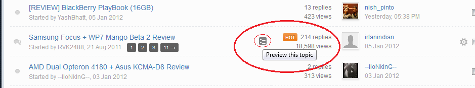
5. I did prefer VB. It was more of a forum-ish feel, and more discussion oriented. Thread previews on mouseover, for example, was a huge help to decide whether or not to open a thread.
You can still do that. See screen below
[attachment=10976review.png]
The messages could be archived and saved, there is no such option now and I had to delete a bunch of messages with fairly useful information in them just to make room for more, and I could not save their text unless I opened and copied the text from each of them individually.
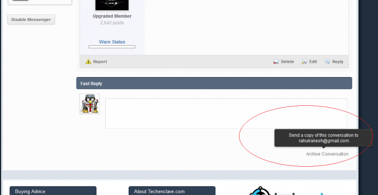
You can still do that. And I feel probably in a better way. See screenshot below.
[attachment=10975:archive.png]
I guess one has to move with the times and that is the core of a technology forum. However I think a forum is still a forum. Not to negate the hard work that the team has put in - but I would request a look at it from a discussions perspective as well.
I agree that these are big changes from the way we have been doing things. Such changes are usually hard to get used to. But if you do get used to it then they end up making your life better. Just my point of view.
Attachments
Actually, the contrast on the quoted text in a post does seem low.
Also, the gap between two posts seems a bit large because of the grey Report and quote bar and the blue header bar. Any ways you can reduce thewidthheight of those?
1. Adjusted. Just clear your cache once.
2. The gap was even more earlier with all the user information on top. I had measured the gap in both earlier setup and the current setup and found that earlier setup used to take more scrolling. Anyway will see how to optimize that later.
Will look at the guest thing tonight.#Renegade any update about the guest-thing ??
- Status
- Not open for further replies.