By unusable, I mean either incredibly slow, or with no or near useless filtering options, or bad data that makes filtering useless, or a combination of the 3.
For the first, a prime example is primeabgb. The site's performance is abominable, its price sorting is so screwed up sorting low to high shows a 60K SKU before a 1K SKU.
Most popular sites, including MD, Vedant, PCstudio, EZPZ, etc. are guilty of the second. Primeabgb is an exception for this, but that brings us to...
Bad data:
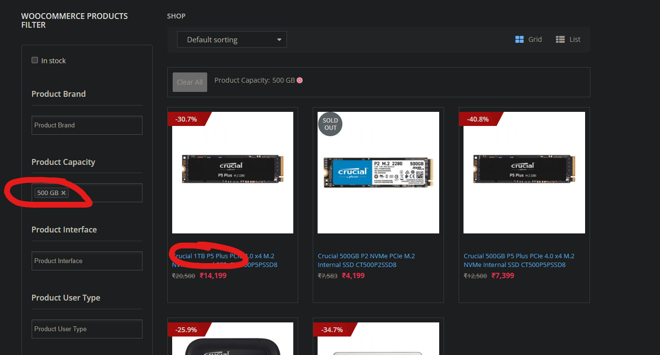
Look at this shit. What's the point of the filtering if your data is bad? How hard is it to get clean data for your backend?

In this example, you might say, "It's just 1 bad data point". But if they can miscategorize a 1TB drive as 500GB, how many 500GB drives have they mislabelled? How is the user expected to browse all 500GB drives they have?
Are Indian tech ecomm sites just offline stores playing at being online businesses? It really seems that way since none of them care to make it convenient to browse. Sure, if you know exactly what you want, search for it, add to cart, and checkout. That much works fairly okay. But other than, it's just an abject failure of any attempt to inject even a modicum of good UX.
Earlier, Amazon used to have fantastic filters, even if the data was a bit sketchy, it mostly worked. Now it has a bunch of useless filters and searching for stuff is a PITA. I will say though, that The IT Depot seems to be an exception to all 3 of these, and that tracks as they started out as, and primarily still are, an online store.
For the first, a prime example is primeabgb. The site's performance is abominable, its price sorting is so screwed up sorting low to high shows a 60K SKU before a 1K SKU.
Most popular sites, including MD, Vedant, PCstudio, EZPZ, etc. are guilty of the second. Primeabgb is an exception for this, but that brings us to...
Bad data:
Look at this shit. What's the point of the filtering if your data is bad? How hard is it to get clean data for your backend?
In this example, you might say, "It's just 1 bad data point". But if they can miscategorize a 1TB drive as 500GB, how many 500GB drives have they mislabelled? How is the user expected to browse all 500GB drives they have?
Are Indian tech ecomm sites just offline stores playing at being online businesses? It really seems that way since none of them care to make it convenient to browse. Sure, if you know exactly what you want, search for it, add to cart, and checkout. That much works fairly okay. But other than, it's just an abject failure of any attempt to inject even a modicum of good UX.
Earlier, Amazon used to have fantastic filters, even if the data was a bit sketchy, it mostly worked. Now it has a bunch of useless filters and searching for stuff is a PITA. I will say though, that The IT Depot seems to be an exception to all 3 of these, and that tracks as they started out as, and primarily still are, an online store.
Last edited:
