Been around TE for ages, was my 2nd home & I loved jumping IN & Out…… mostly on my desktop [On phone it )
TODAY ….when I Dive inside TE …. my “parachute” just flips off me …… and then desperately rush thru the first patli-galli (to save myself) ….. and get LOST again ….. The old discord was easy too.
Why is it so difficult now to just hover over an ID I would like to follow @Heisen@icysmoke … but LOST again
But NO ….. I ain’t giving up …. not while I still have a few “teeth” left
Back and forward buttons show up for me on the bottom of the page, they only appear after you scroll up a little, when you scroll down they auto hide. I’m on iOS 26.1 as well.
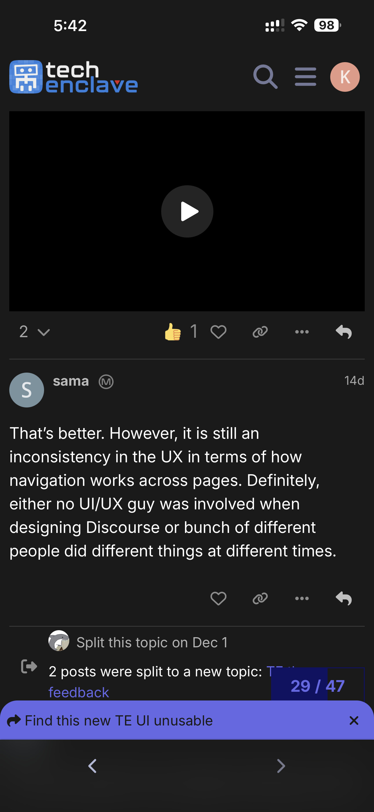
Everyday it seems mods and others are hell bent on making TE unusable.. (take this on a lighter note)…
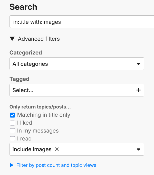
Many shortcuts are invalid.. I struggled a lot with the UI and was managing to find something new with shortcuts..
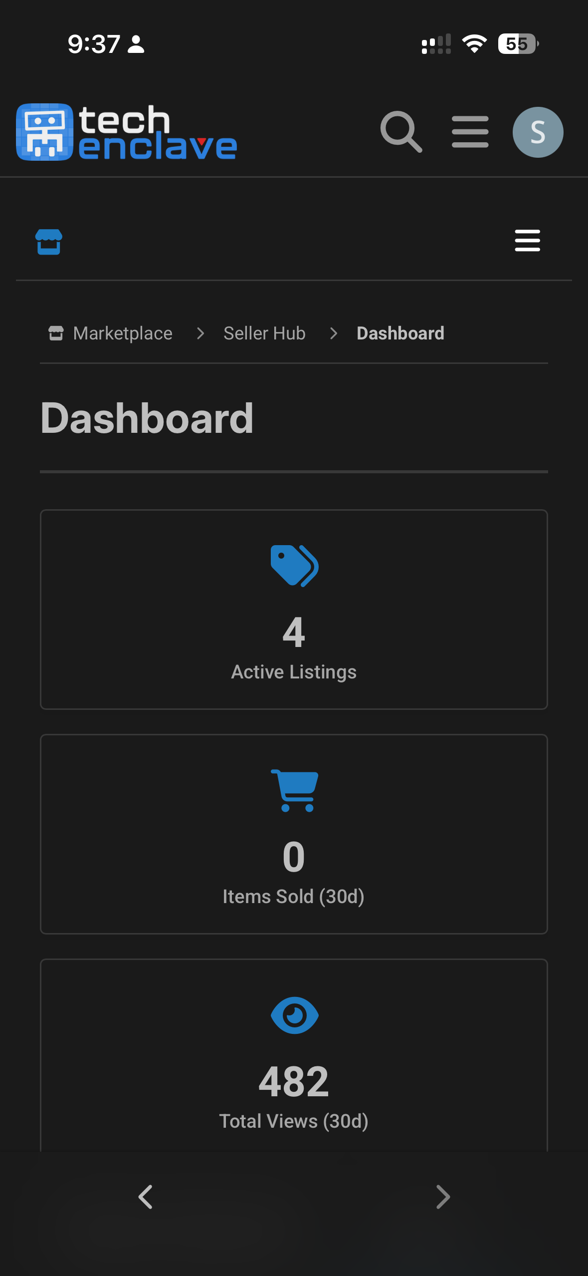
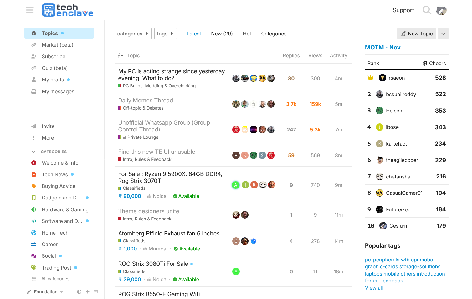
Separate market place is good, reminds me of Discord group , but then the icon / image are small , the details minimal to nil.. no clarity , frustrating..
In addition to the back issue, also encounter issue with loading of the market posts on occasions as mentioned previously.
Also it seems pointless to show the listings count upfront but to then have to select View all listings to actually see the listings. Having it hyperlink to the listings would be more intuitive.
I wasn’t sure when @Renegade proposed the change, but its grown on me a lot. Gotta say, he was right.
To anyone else having issues, its just a huge change at first and takes some time. The visibility inside sub forums is still not that great, but it grows on you a lot in a month or two as you use it and literally everything else is much better than XenForo.
The reasons we were given is no more development ergo no security updates which means xenforo in its present state was a sitting duck from a security pov.
That’s why the change. Everybody was taken along kicking and screaming.
Yeah, you do get used to it after a bit when it dawns the old one isn’t coming back
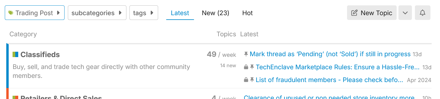
Oh yeah, I just saw your post about not finding the ‘list of fraudulent members’ sticky and was checking if it’s pinned. It’s been pinned in Classifieds (same as on xenforo), and I see pinned threads are visible in root trading-post. But let me know where else is suitable.
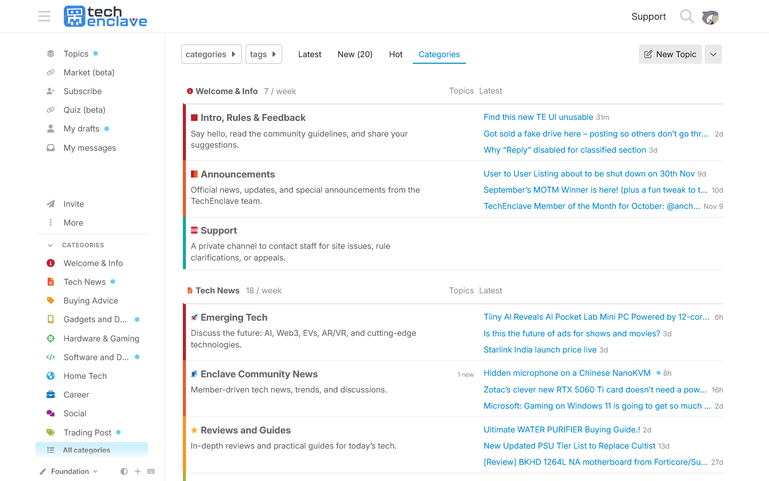
The organisation of information and its density is quite bad even with the Categories view, to the point it just makes sense to stick to the default view, where not a lot of content feels worthwhile to go through.
The temporary Discourse site was not well promoted it seems because somehow I missed it altogether. If it was made clear that there is no option but to switch, then probably could have provided better feedback to make Discourse more palatable. Still think a completely different layout would make content more accessible.
Right now, it is mostly a matter of sticking with what’s there to be part of this community. Even now, when switching from the painful Safari experience to using Librewolf on a laptop, I find that “quote text” doesn’t work. It just breaks a lot of things on a lot of different setups.