[SHOW-OFF] Artwork-Design
- Thread starter DanDroiD
- Start date
You are using an out of date browser. It may not display this or other websites correctly.
You should upgrade or use an alternative browser.
You should upgrade or use an alternative browser.
- Status
- Not open for further replies.
Followed along with a couple of 3d Palace tuts on automotive modeling. Crits are most welcome.
I have a couple of questions I'd like help with though.
1. Would appreciate if someone could explain why the reflections of the area light on the bonnet & windshield (pic nos. 5 & 6) appear jagged. Isn't the reflection supposed to come off as a straight line?
Could it be due to bad topology? Or maybe something not set properly in the car paint shader?
2. In a studio setup such as this where the background is black, how would you set up a reflective material like chrome so it gives off pleasing reflections? As is, the reflections turn out black of course.
So is it the same as in photography, where they set up white boards at critical spots? Or maybe some bitmap in the environment slot would be a better option?
Many thanks.
PS: Modeled in Max, & rendered with MR. Materials used are chiefly A&D materials, with the exception of the body paint which is the car paint shader.
1.

2.

3.

4.

5.

6.

7.

I have a couple of questions I'd like help with though.
1. Would appreciate if someone could explain why the reflections of the area light on the bonnet & windshield (pic nos. 5 & 6) appear jagged. Isn't the reflection supposed to come off as a straight line?
Could it be due to bad topology? Or maybe something not set properly in the car paint shader?
2. In a studio setup such as this where the background is black, how would you set up a reflective material like chrome so it gives off pleasing reflections? As is, the reflections turn out black of course.
So is it the same as in photography, where they set up white boards at critical spots? Or maybe some bitmap in the environment slot would be a better option?
Many thanks.
PS: Modeled in Max, & rendered with MR. Materials used are chiefly A&D materials, with the exception of the body paint which is the car paint shader.
1.

2.

3.

4.

5.

6.

7.

madhukannan
Galvanizer
Again followed a step by step tut for the modeling in 3ds Max. Textured with MR materials in Max & PS; Rendered in Mental Ray with the MR sun & sky for the lighting. Final colour, contrast, sharpness etc. tweaked in PS. Comments & crits welcomed. Thanks for looking & the likes on the previous ones.


^ Excellent texturing and pretty decent lighting. However those rocks there look very hastily duplicated and shifted a little bit, move/rotate them a bit so they look more random. Also try blurring the floor texture as it seems a little too sharp.
The tut had nothing on smoke/dynamics?
The tut had nothing on smoke/dynamics?
^ Excellent texturing and pretty decent lighting. However those rocks there look very hastily duplicated and shifted a little bit, move/rotate them a bit so they look more random. Also try blurring the floor texture as it seems a little too sharp.
The tut had nothing on smoke/dynamics?
Thanks for the feedback.
You're right about the environment not getting much love. It was kinda hacked together just to have something for the model to sit in. I'll really need to go into environment modeling & texturing in depth. But I'm keeping that for later.
As for the ground bump, when I was testing it with low anti aliasing settings, it looked about right. But after bumping up the settings, I agree that it is way off! Something I need to be aware of the next time around.
The tut only was for the modeling. The rest was what I've learned over time. In fact, the texturing was achieved with a technique I tried out for the 1st time, viz. through projections without unwrapping, thanks to Neil Blevins & his soulburn scripts.
What it also meant though was that I struggled getting it to work on every object exactly the way I wanted. For instance, I couldn't get the dirt & grime to work on the front-most, smaller wheel & the ladder.
As for dynamics, I know what you're getting at. Some steam from the funnel & around the wheels, dust particles in the environment etc. would have added a lot. But again, I've kept learning all of that for later. I'm currently concentrating on hard surface modeling & texturing. In the mean time, I'm also learning (trying to, anyway) human anatomy. Bit by bit I'll move towards modeling & texturing organic forms in Zbrush etc. & take it form there.
..... At least that's the plan,
 .
.Again, thanks for the feedback. I'd also appreciate any further tips or advice. It's all welcome.
demonhead
Explorer
few of my artwork...used faber castle drawing pencils and brightness and contrast adjustment in picasa 
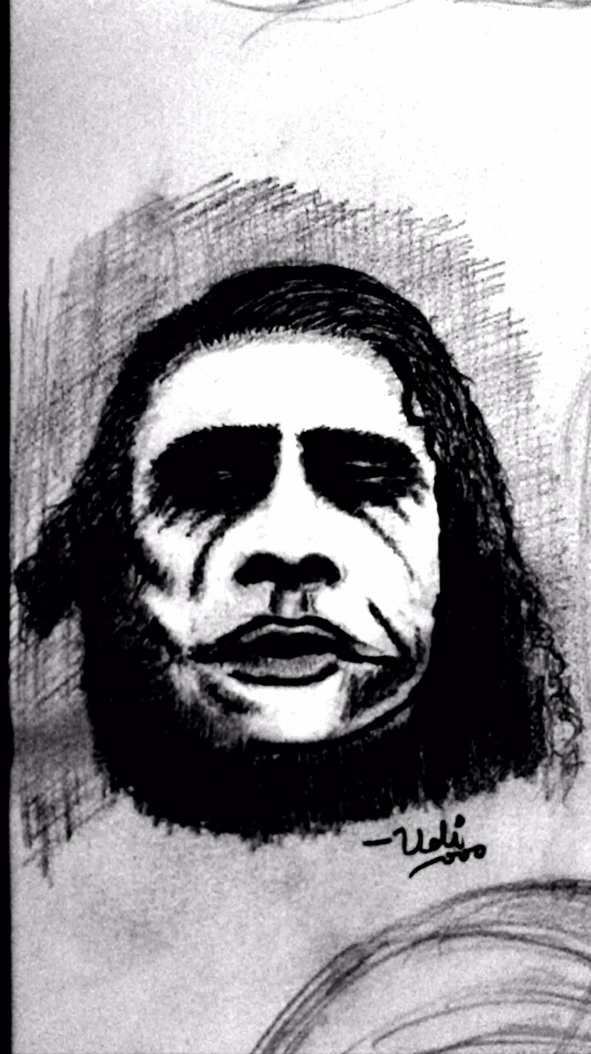
heath ledger as joker
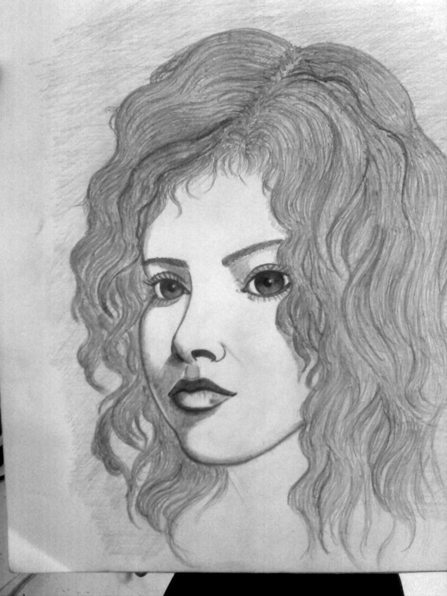
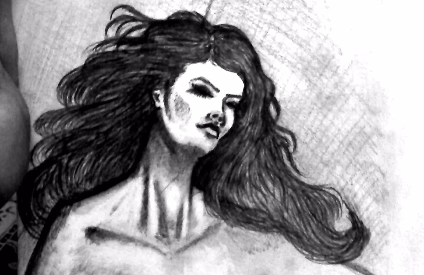
experiments with shading
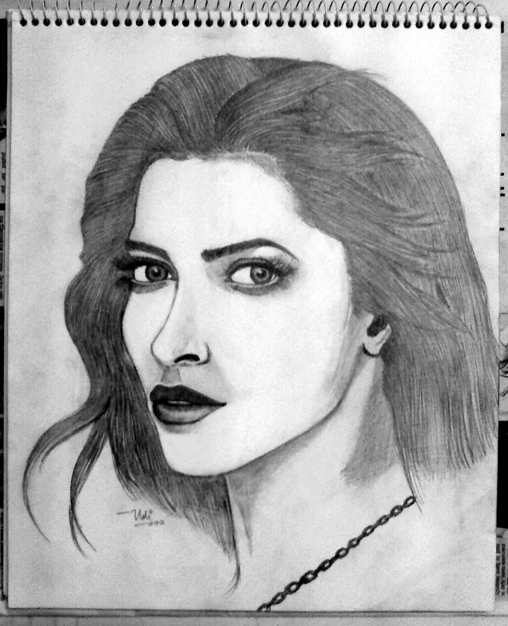
suppose to be deepika padukone
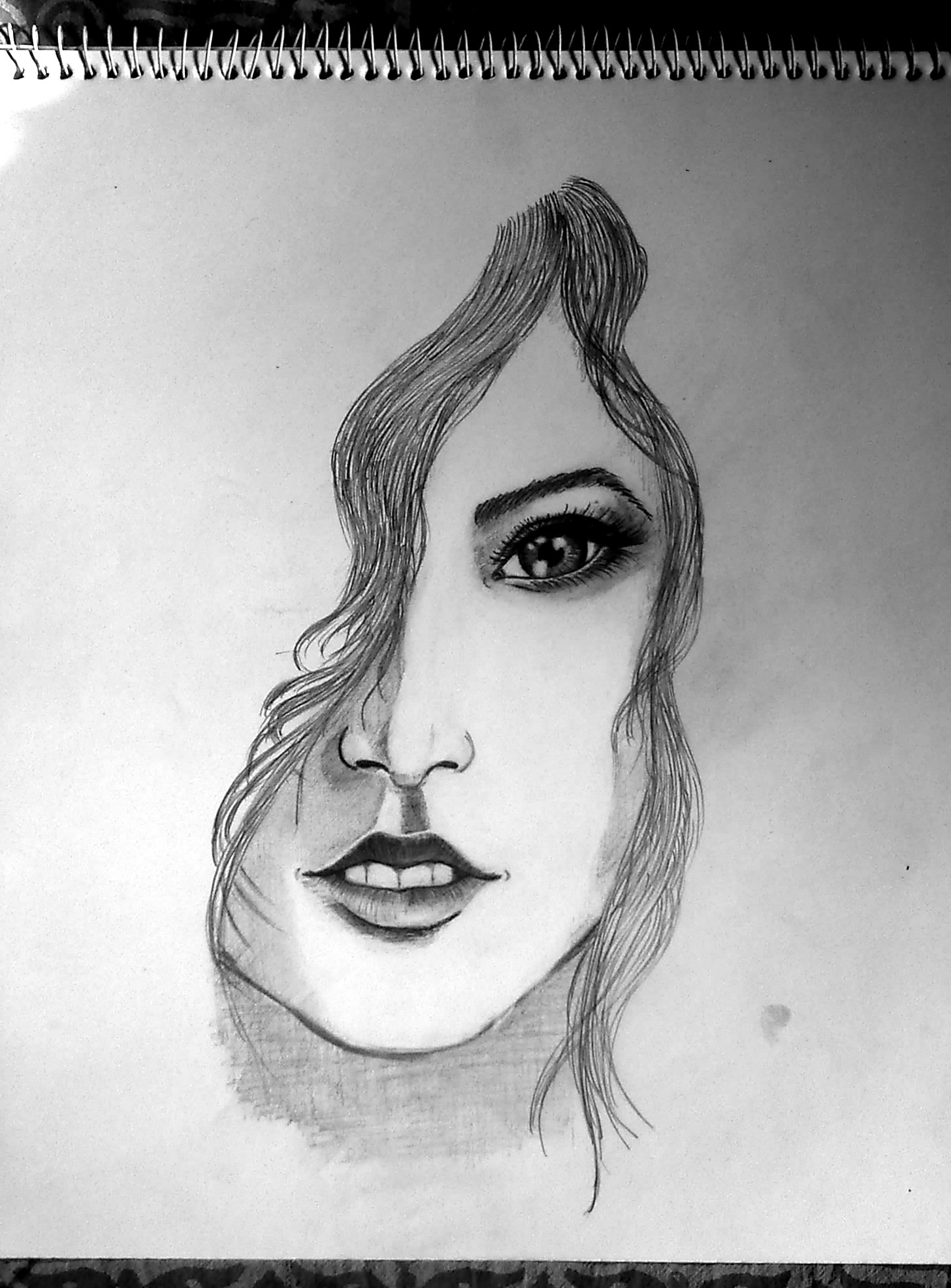
thanks for looking

heath ledger as joker
experiments with shading
suppose to be deepika padukone

thanks for looking

Nice work guys! ^^
here one of my 3D artwork I created in 3ds Max.

here one of my 3D artwork I created in 3ds Max.
Last edited:
Wow! Fantastic. You a pro or a hobbyist?Nice work guys! ^^
here one of my 3D artwork I created in 3ds Max.View attachment 39115
& would you be so kind as to briefly touch upon the lighting & materials setup you've used? Eager to learn. Thanks.
@kidrow: Thanks  well, I'm a bit of a both, Started 3d as a hobby, self-taught, and working as a 3d artist.
I modeled the car in 3ds max and Rhino, rendered in Keyshot with a custom HDRI I created, materials used were Dupont automotive materials, a bit of post work in After Effects and background added in Photoshop.
 well, I'm a bit of a both, Started 3d as a hobby, self-taught, and working as a 3d artist.
I modeled the car in 3ds max and Rhino, rendered in Keyshot with a custom HDRI I created, materials used were Dupont automotive materials, a bit of post work in After Effects and background added in Photoshop.
@Praveen3D Thanks for replying. I'm in a similar boat as regards having started 3d as a hobby & now wanting to make a career of it. It's taking a while to learn it all though,  . Hope it all works out well in the end.
Also thanks for lending an insight into your workflow. Knowing a bit more about these things always seems to help throw up newer ideas to explore. Cheers & keep posting more of your work!
 . Hope it all works out well in the end.
 Also thanks for lending an insight into your workflow. Knowing a bit more about these things always seems to help throw up newer ideas to explore. Cheers & keep posting more of your work!
Last edited:
@kidrow
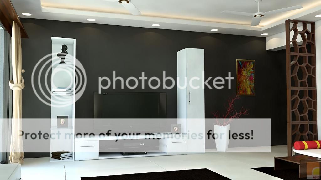
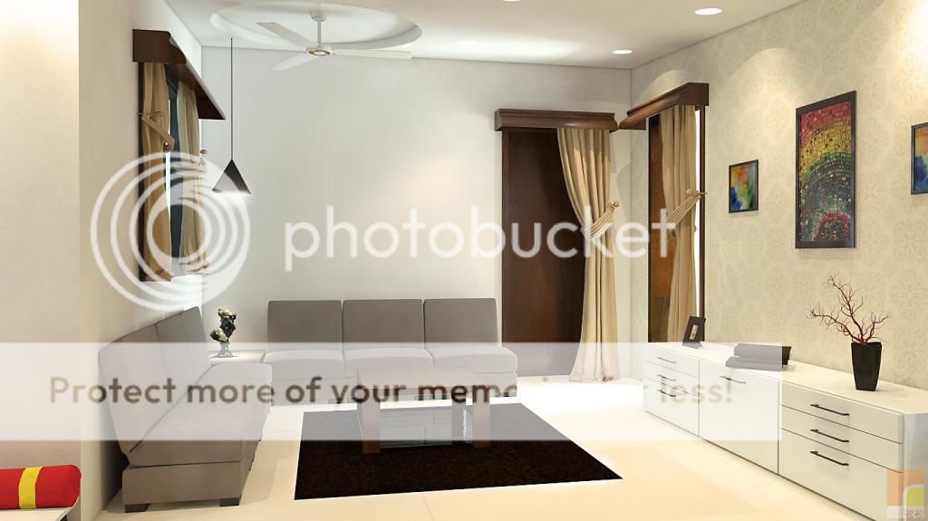
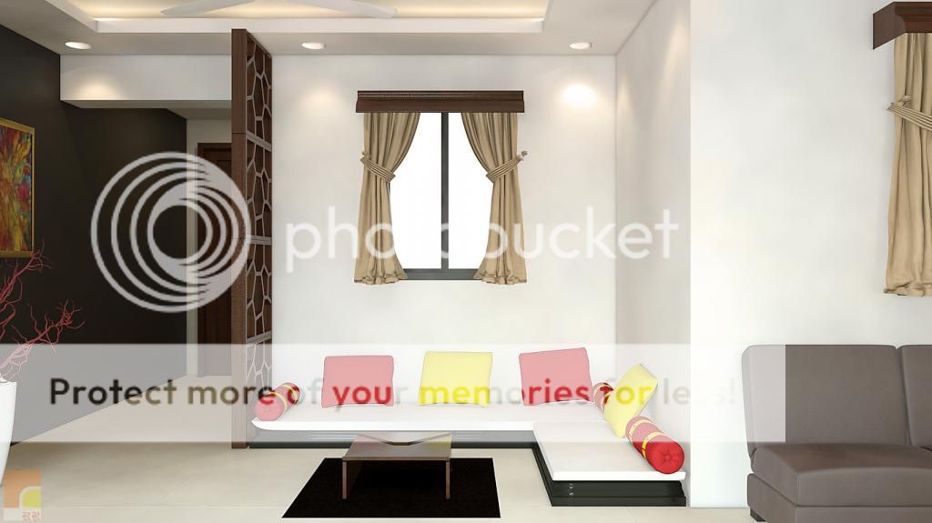
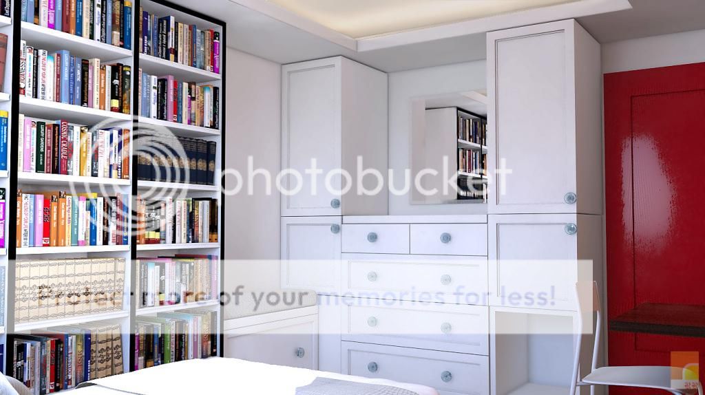
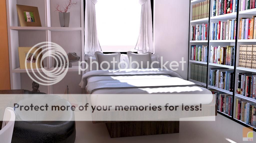
Wow some of your stuff here is really good especially the stuff you posted at the top. The interior design work is also good, especially in the lighting department. But your texturing could be slightly better. You are using some bump and specular maps which is good, but your UVs look a little bad (judging by the rough looking beds covers and oversized wood textured beds. Besides this theres nothing more I can say suggest to help you out in these interior scenes as these images already match expectations for the work I currently do.
How about you take it up a notch? Try making a complex garden scene with a pool or pond in it which will require you to instance high poly trees and plants, cheat with texture maps, figure out water and its ior /usage of caustics and ultimately learn to handle your system memory and file size.
- Status
- Not open for further replies.


